Prrimital
Back to the beginning.

We needed to come up with a winning and distinctive proposal. A concept that would be appealing and easy to understand within the context of the San Miguel Market, but which would also enable us to scale up a brand whose ambition is to reach much further.
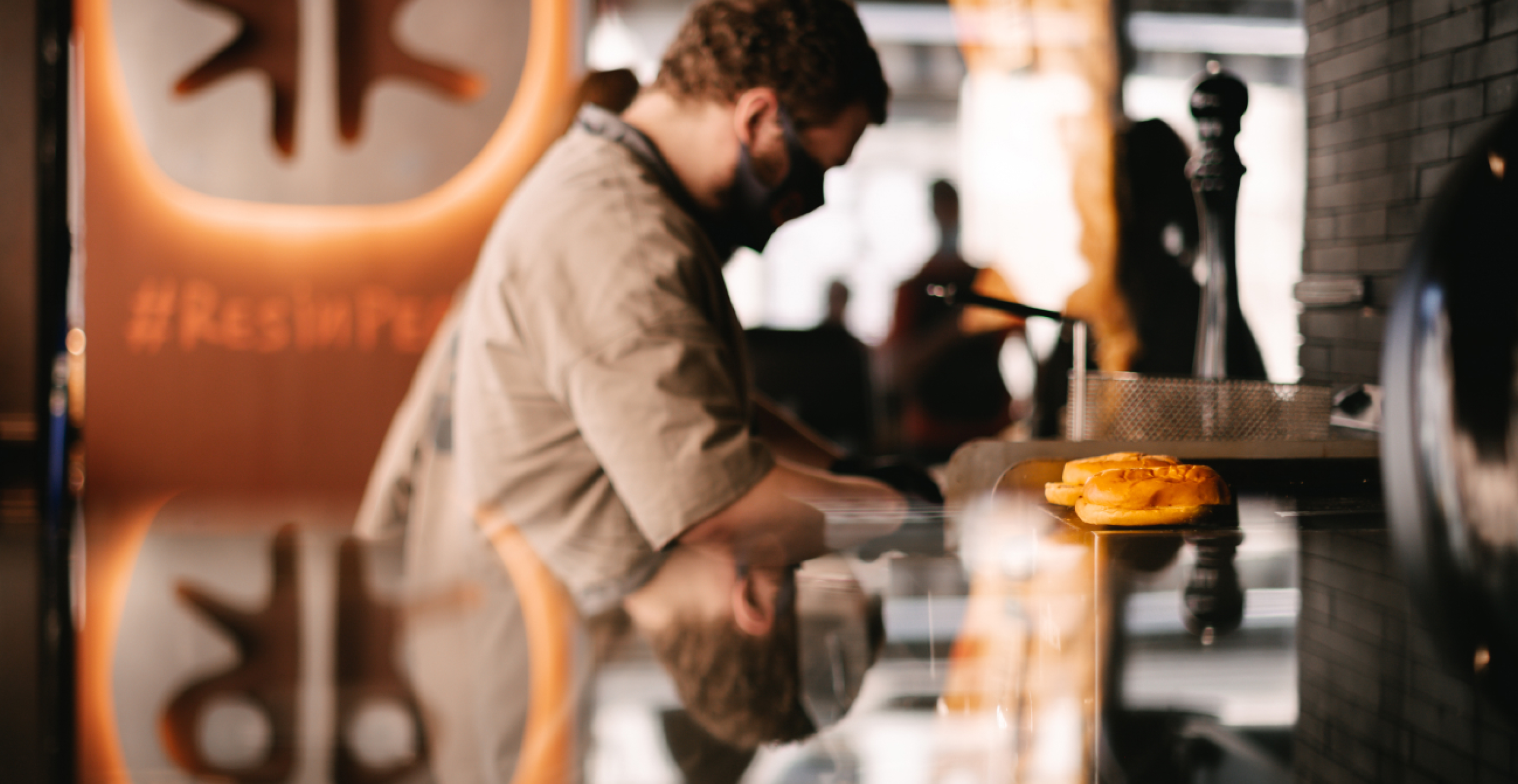
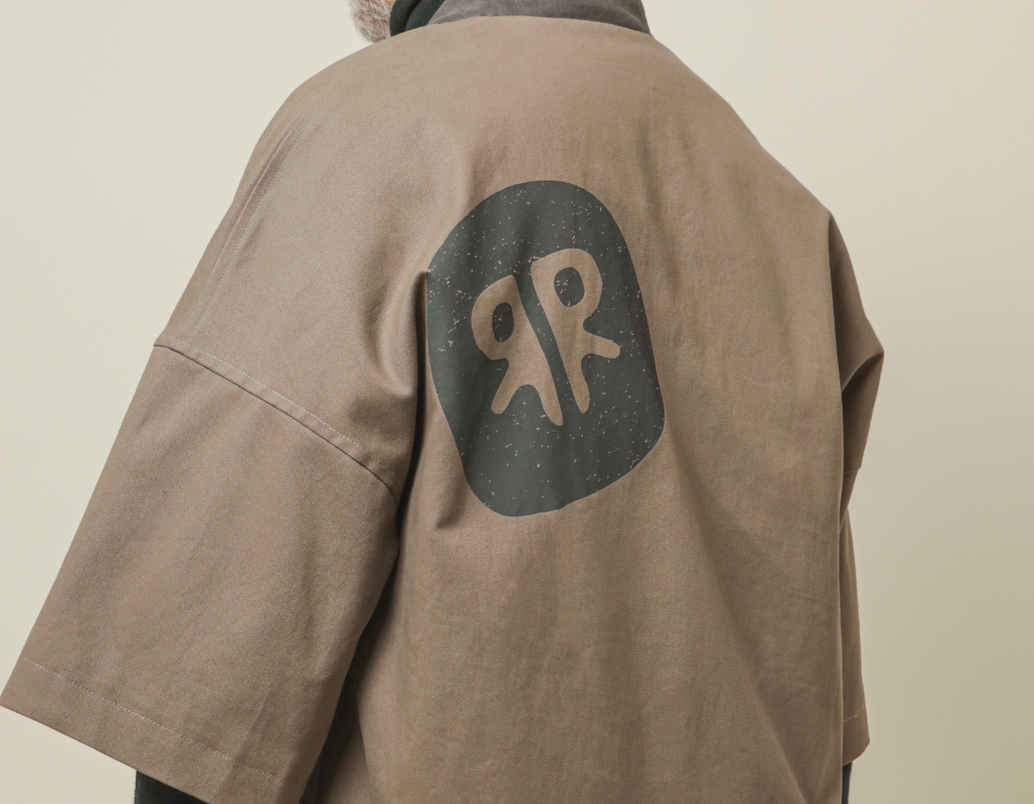
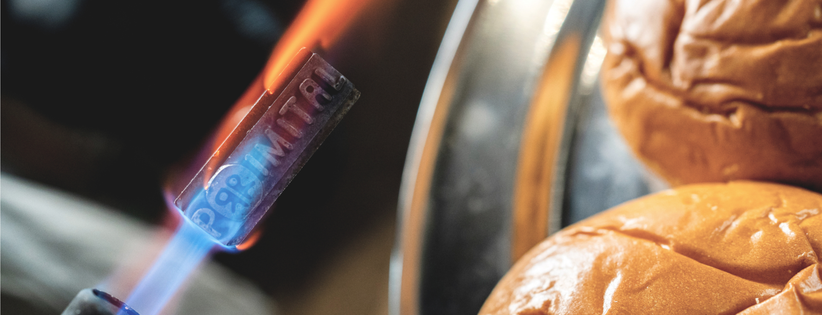
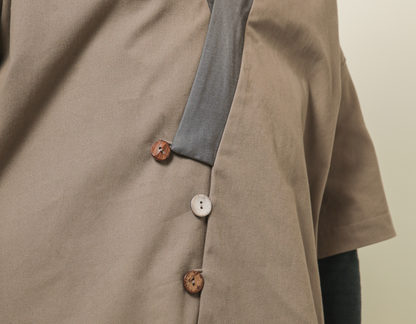
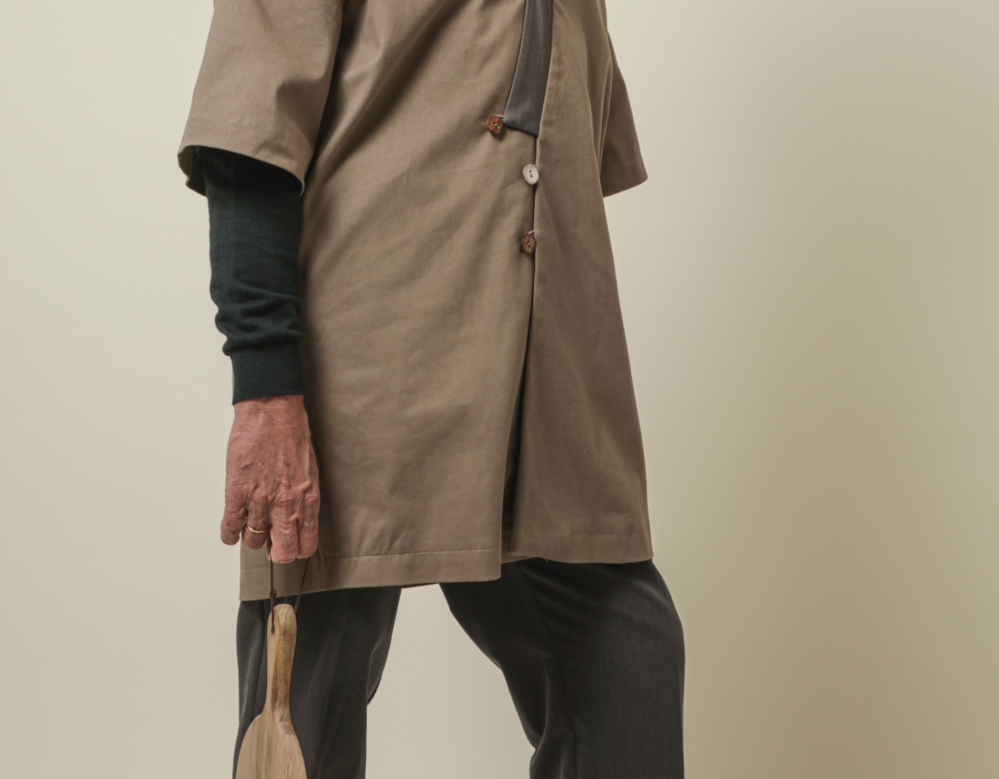
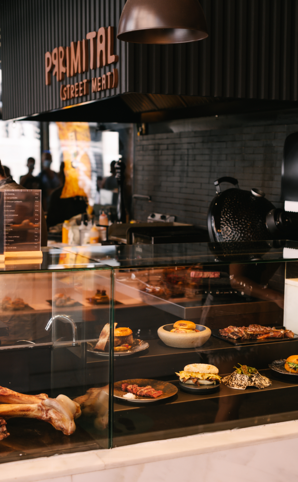
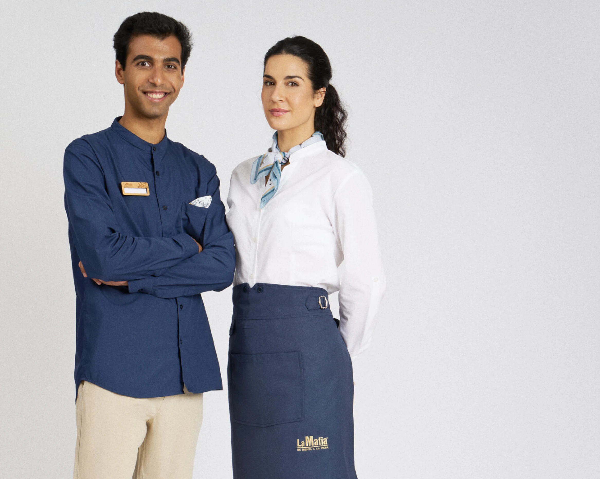
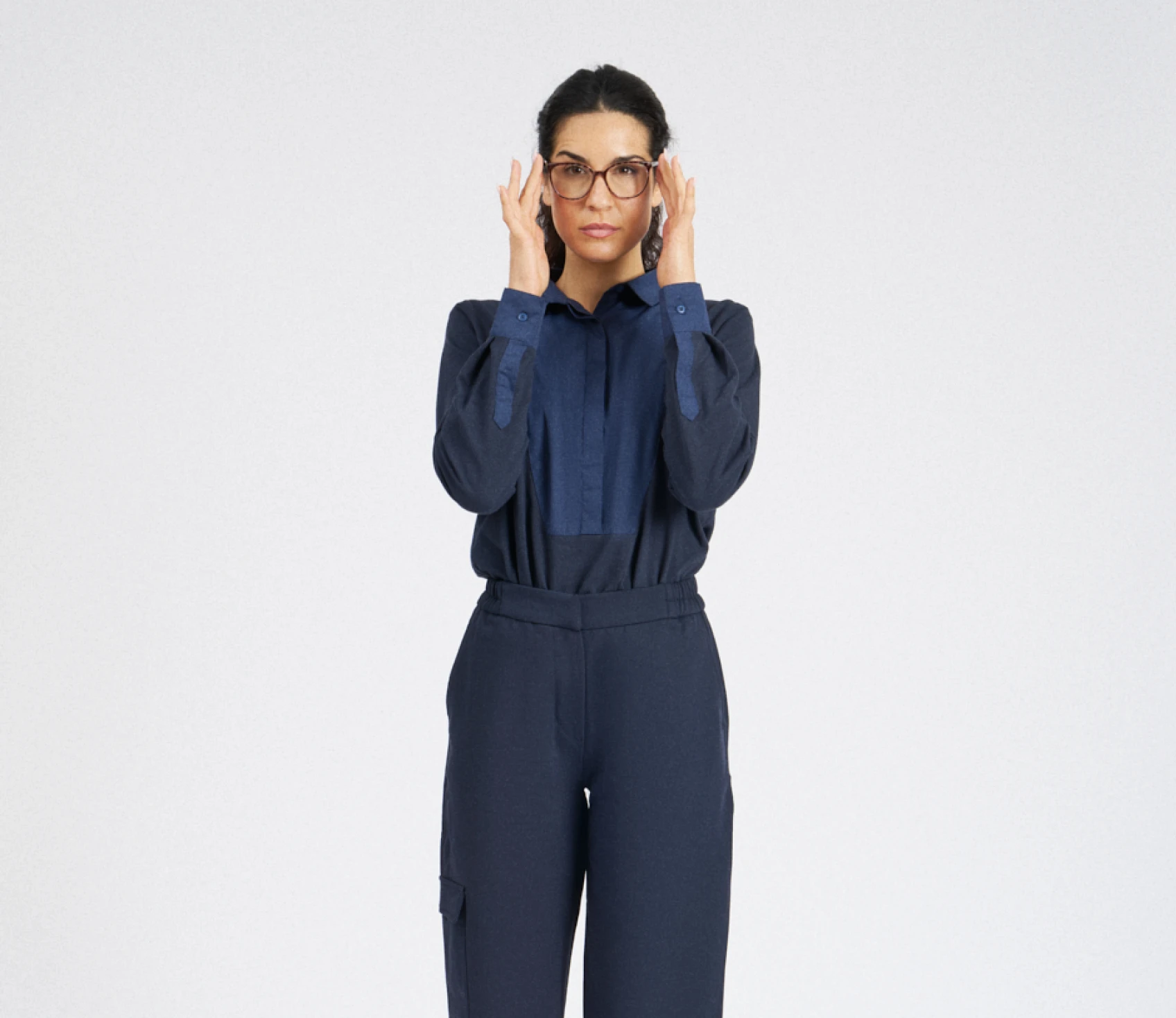
A br(r)utal brand. Prrimital’s creative concept is rooted in the idea of ‘origin’. A gastronomic concept born of an obsession with raw ingredients. With this in mind, we wanted to build on that premise to trace our roots back to the ‘origin’ of humankind, early societies and the earliest dietary habits. In pursuit of instinct, naturalness and rawness, we designed an imperfect brand using a rudimentary, hand-crafted typeface. The double-R isotype creates a powerful, memorable and ambiguous image. A skull? A cow’s hip? Two men dancing? In primitive art, imagination and abstraction are the foundations for creating such heavy expressiveness. If you ever failed a primary school exam because of your spelling, now’s your chance for revenge! At Prrimital, we love crooked lines, mirror-image letters, spelling mistakes and cross-outs. The Corner: Defining Streetmeat. A sanctuary for carnivores, a meeting place for all meat lovers. The bonfire at the heart of the tribe. A space for sharing and celebration. Ancient attire. To ensure uniformity, we’ve developed a versatile garment—gender-neutral and one-size-fits-all—that allows for ease of movement and withstands the wear and tear and constant exposure to fire that comes with working at the grill. In prehistoric times, there was no plastic. For the product packaging, we’ve used organic materials to help position the product


.svg)




%201_2x.webp)




Any questions?



FAQ