Ritō Fit House

Building a Fit House 🏋️

No items found.

Merchandise people keep. Brands they remember. Design, production, and management of branded merchandise for teams and customers.

Challenge

You can spot ambition a mile away. Alberto and Mario, founders of a personal training center in Zaragoza 💪, wanted a brand that would take them much further. They had a loyal following, a method that works, a great team, and funding—everything they needed to succeed. But they were missing a creative concept that would catch people’s eyes 👀.

Solution

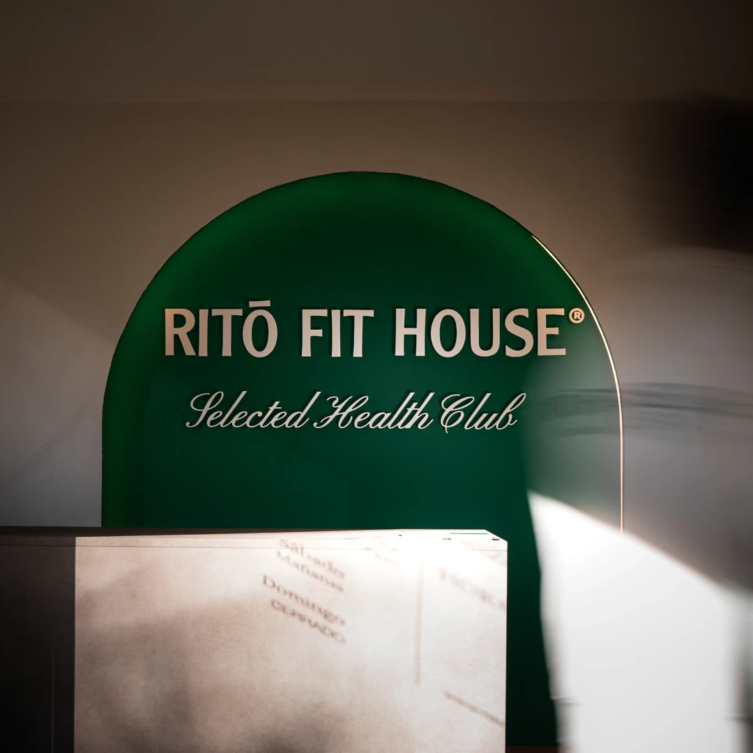
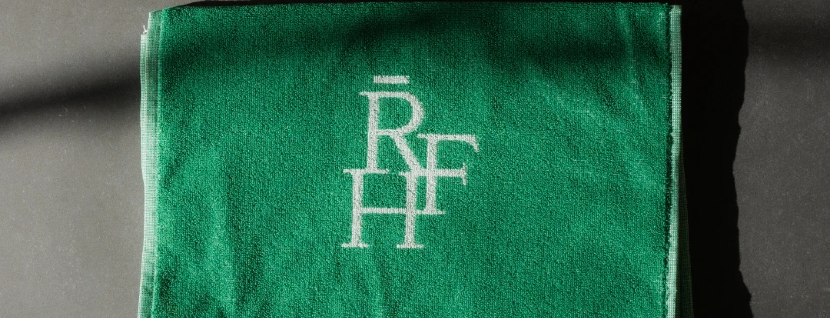
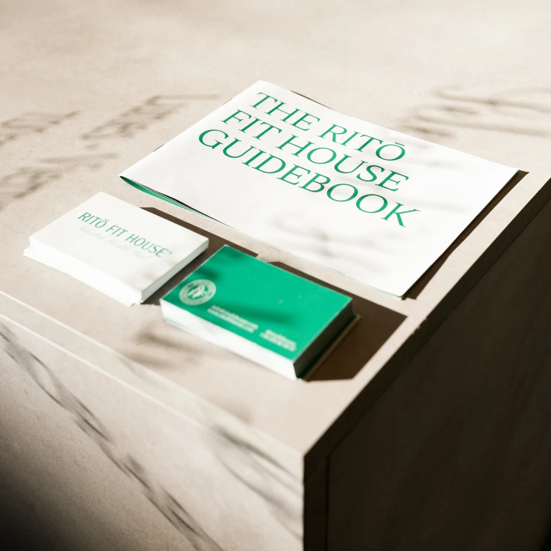
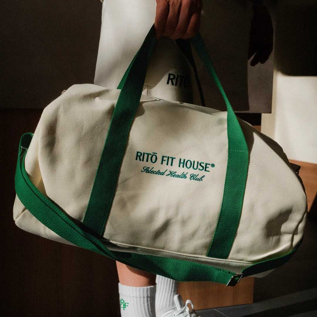
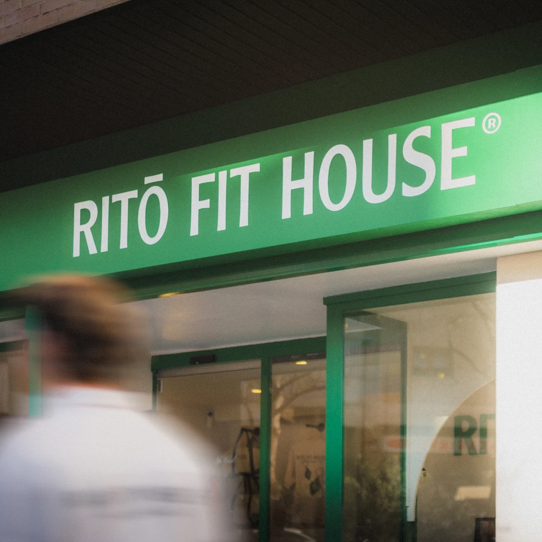
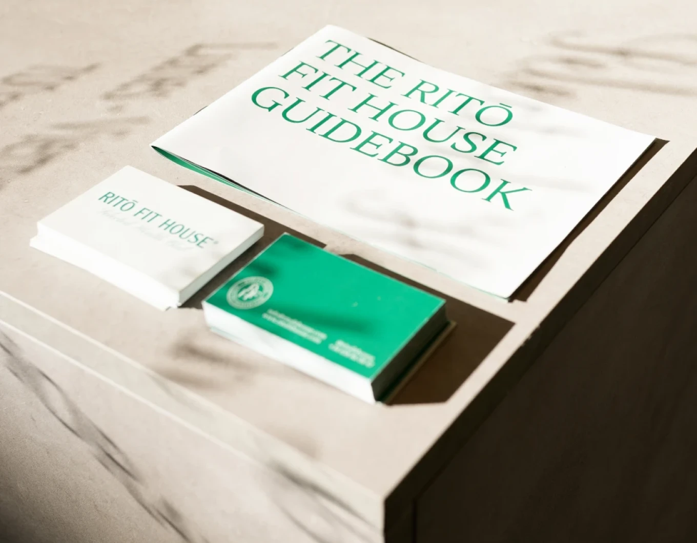
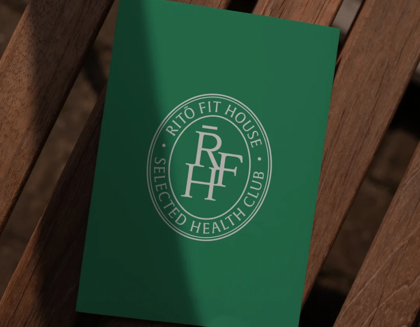
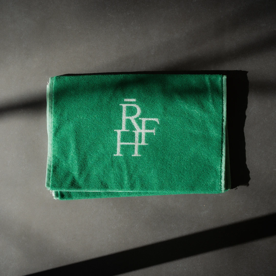
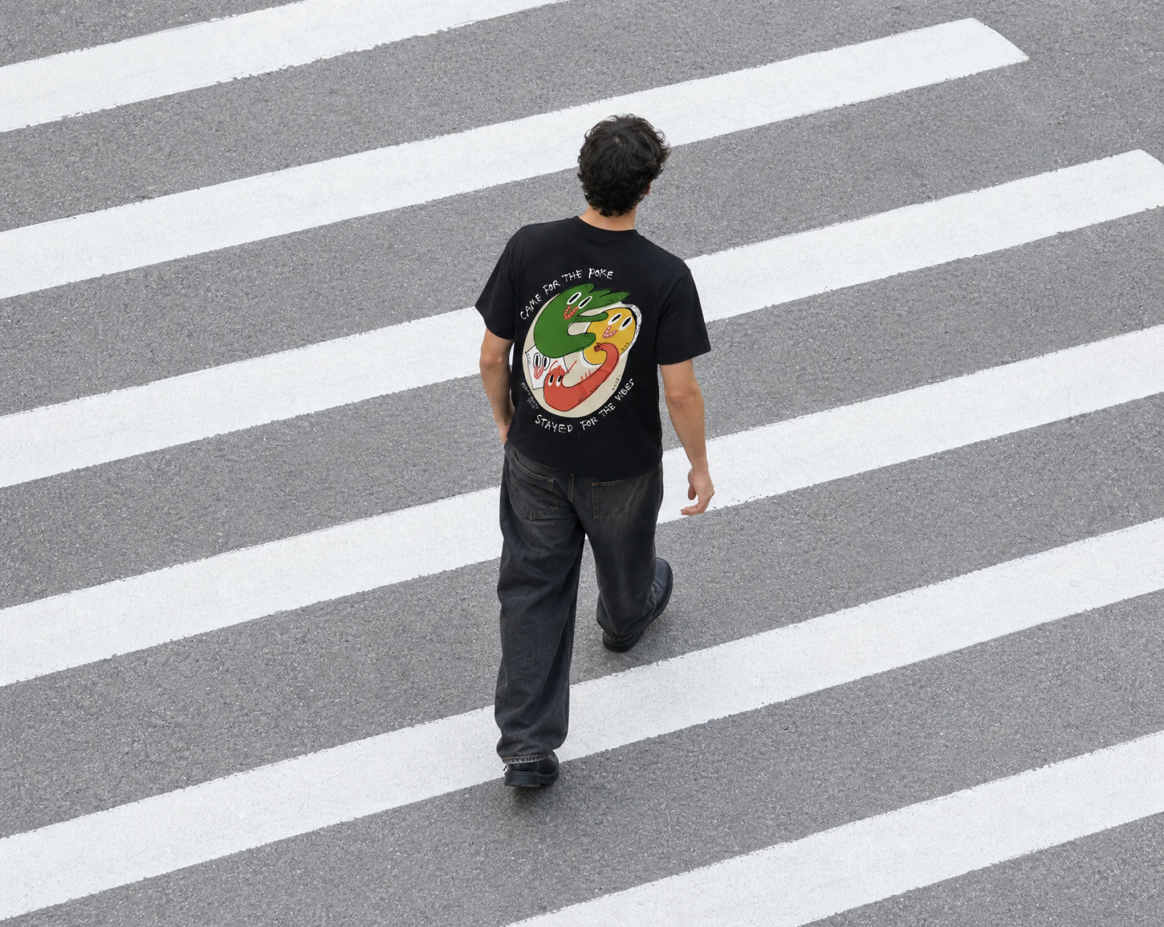
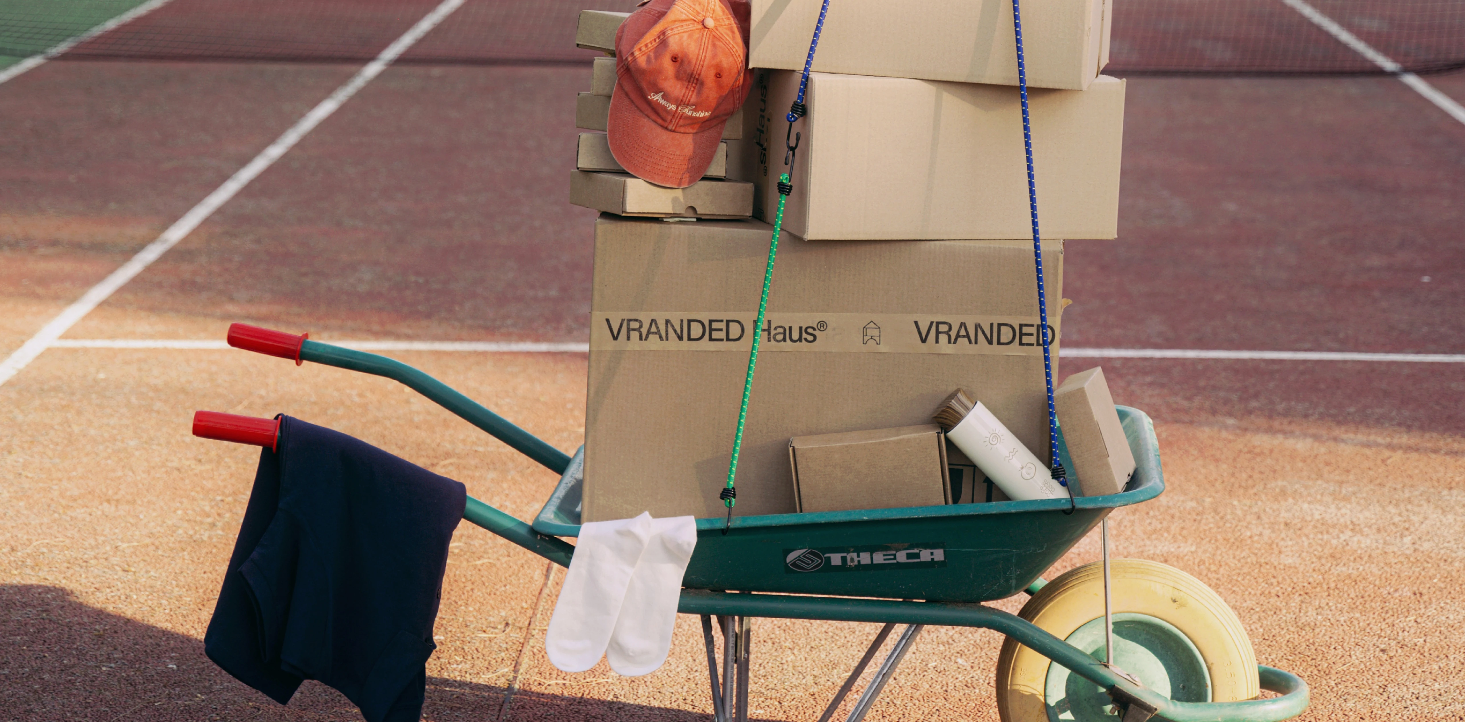
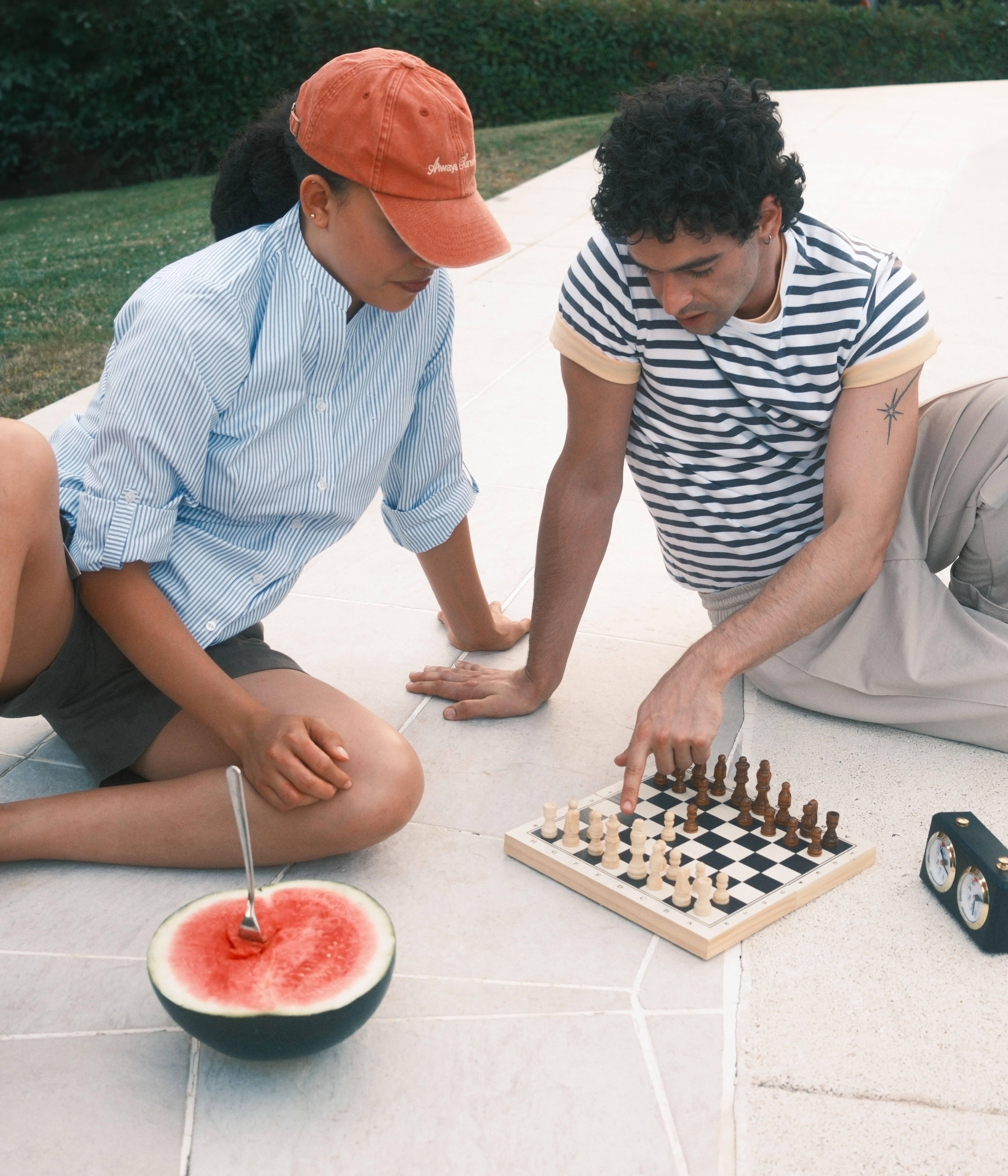
A new concept: the Fit House. Our rebranding project broke away from the traditional idea of personal training to create something new: a Fit House. What is a Fit House? ◼️ The place you’d want to work out if you didn’t like working out. ◼️ One of the few clubs that actually improves your health. ◼️ The fitness space that smells like espresso. ◼️ A Selected Health Club. In short, something completely different. Something we call Ritō. Ritō Fit House is a network of personal training centers that fosters a community centered on sports, health, and positive energy among workout partners. Its identity is inspired by sports clubs and fraternities, bordering on self-parody through an almost cult-like language. A club that grabs your attention at first glance. Its logo draws on the classic typography of these clubs and features a chōon that serves as a purely aesthetic signature. Alongside the logo, we designed a wide range of graphic elements—such as a monogram and dimensional signage—to build an entire universe around the brand. For the website, we crafted a user experience as unique as the Fit House concept itself, while still prioritizing conversion. It was a challenge that really put us to the test. We rounded out the project with a merchandise collection designed to symbolize membership in the “ritual.” It’s the finishing touch for a brand poised to take over the world through training centers, social vermouth gatherings, and a whole lot of ambition.

No items found.
Two people wearing cream-colored sweatshirts with text and leaf designs; one shows the back with horizontal lines and text, and the other shows the front with the text "Born in the Med" and a leaf graphic.
A white star.A white star.A white star.A white star.A white star.
“Letraset sheets containing Lorem Ipsum passages, and more recently with desktop publishing software such as Aldus”
slider arrow left
slider arrow right
A white star.A white star.A white star.A white star.A white star.
"As we’re in the midst of our expansion, Vranded is proving to be a key partner in helping us overcome the issue of uniformity and put it completely behind us"
A white star.A white star.A white star.A white star.A white star.
"There are no limits to the pieces we can create, and they always take great care to ensure the quality of their work."
A white star.A white star.A white star.A white star.A white star.
“VRANDED perfectly brought Juanjo Oliva’s design to life. Excellent fabrics and cuts; three years later, the teams are still delighted.”
A white star.A white star.A white star.A white star.A white star.
"Being able to delegate all day-to-day logistics to our Uniforms Flow system saves us a huge amount of time and resources across our more than 100 stores."
A white star.A white star.A white star.A white star.A white star.
"They have created stylish, comfortable, and high-quality uniforms, having fully understood exactly what we were looking for."

Any questions?

FAQ

What types of projects and brands has VRANDED Haus with?
Do the projects cover only uniforms, or do they also include merchandising and casual wear?
 On what scale does VRANDED Haus ?
How can the work and results of each project be viewed?
 Do clients return to work with VRANDED Haus ?
How does a project with VRANDED Haus ?
Contact Us
START A PROJECT
THANK YOU FOR BEING HERE
Start a project
Be part of the Haus
Start a project
Start a project
01
02
Thank you! We've received your submission!
Oops! Something went wrong while submitting the form.