Wakka
Dive into the Wakka experience
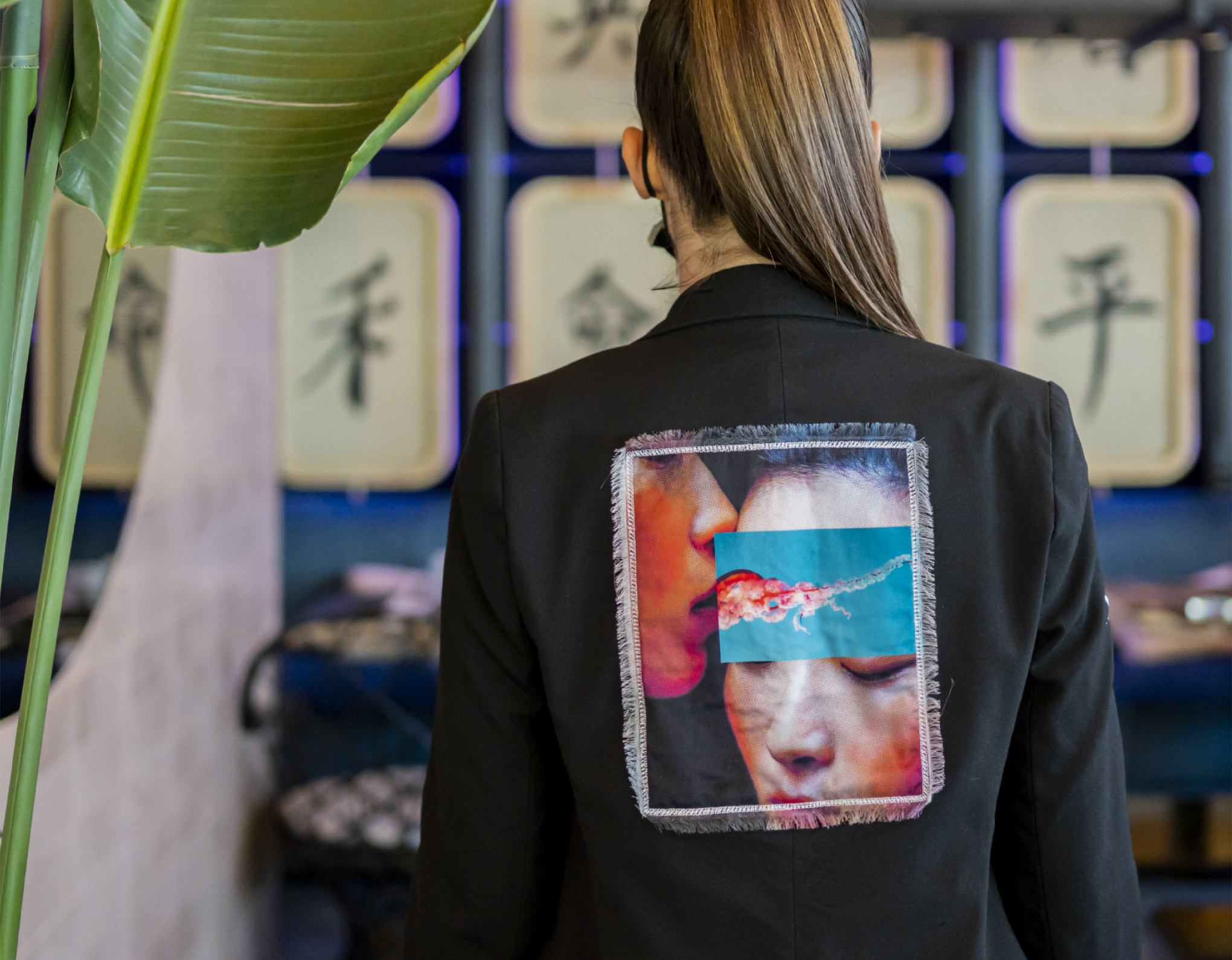
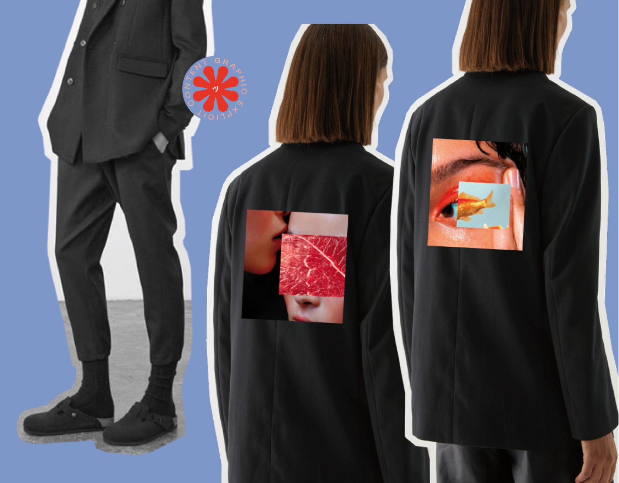
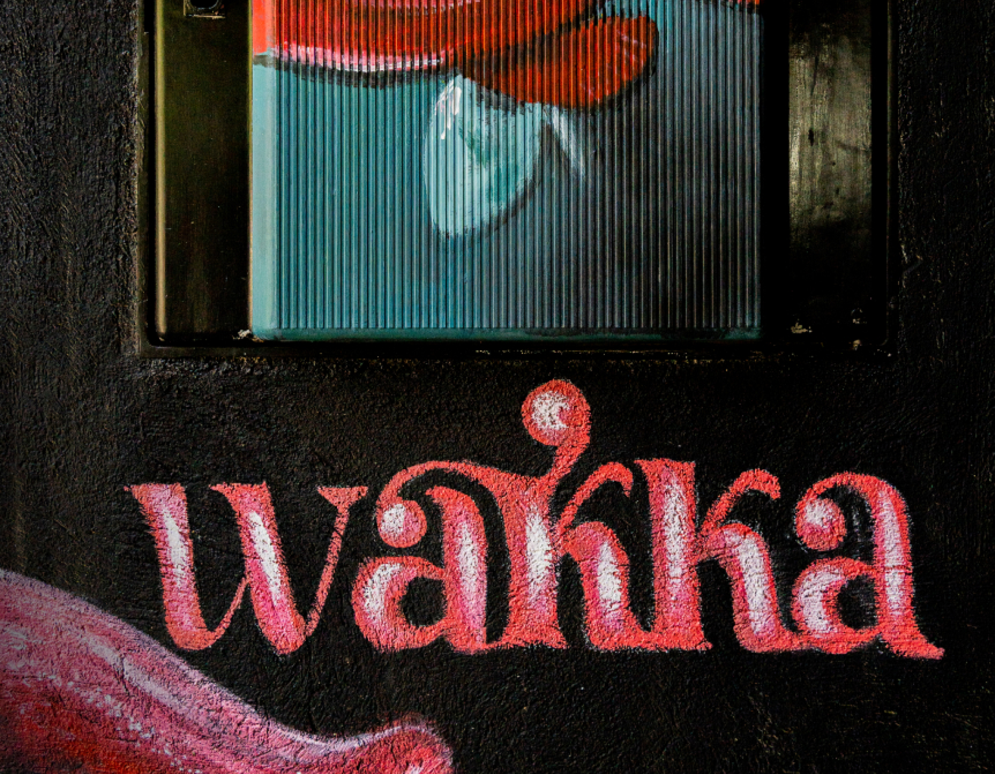
This Asian restaurant was opening its doors in the Arturo Soria neighbourhood of Madrid and needed to do so in the most spectacular way possible. With the aim of launching a modern and disruptive Asian fusion cuisine concept, we set about creating Wakka’s brand identity.
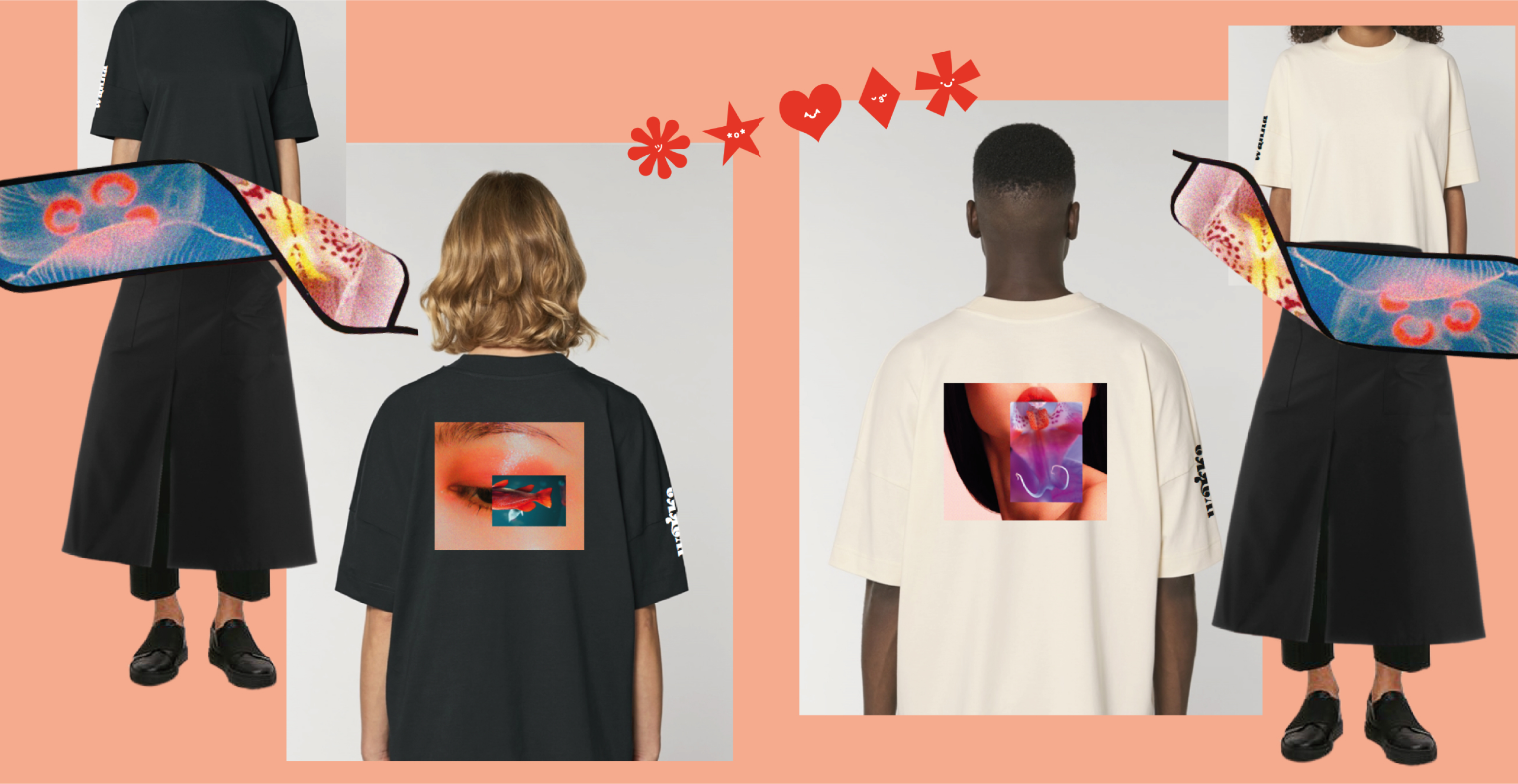
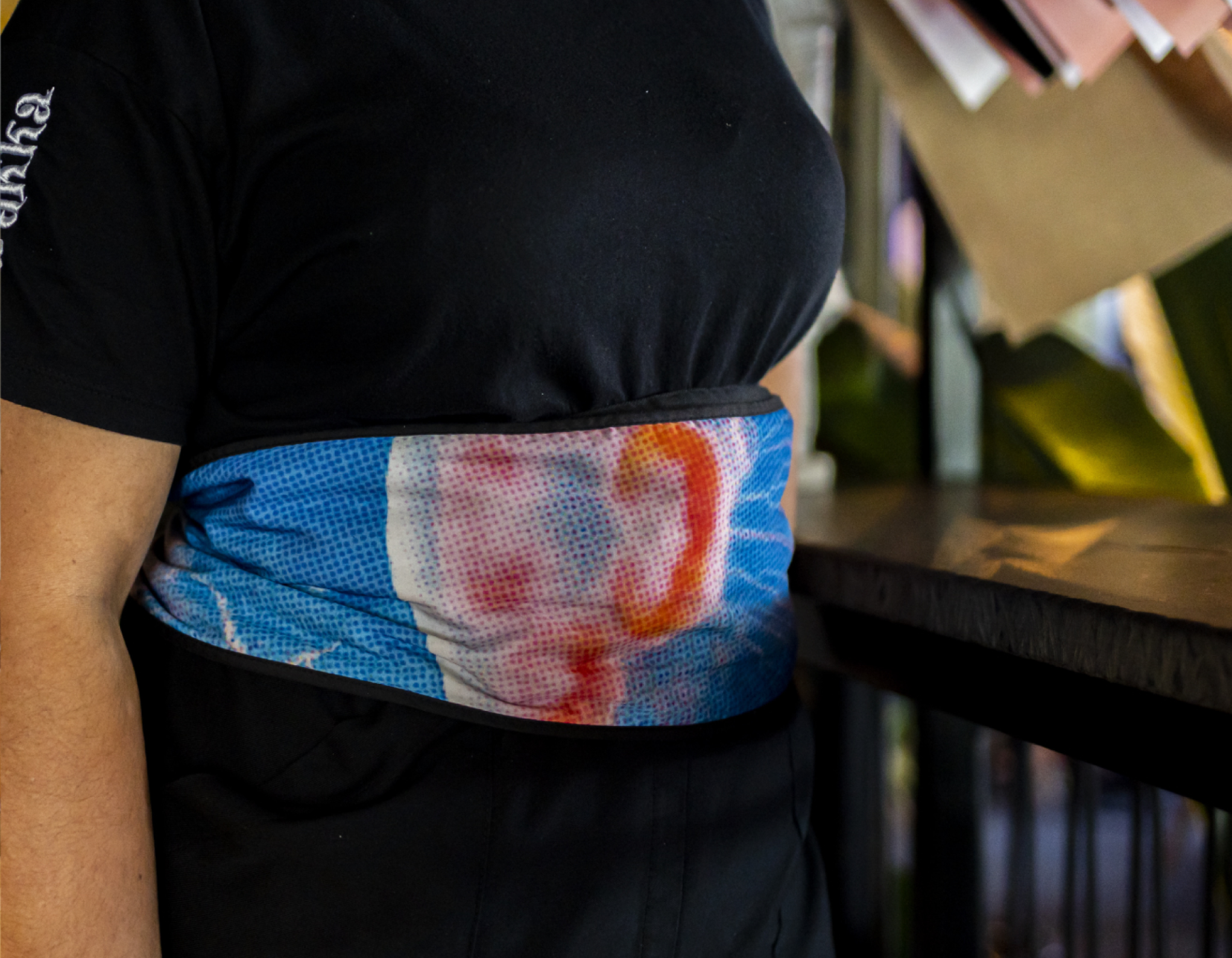
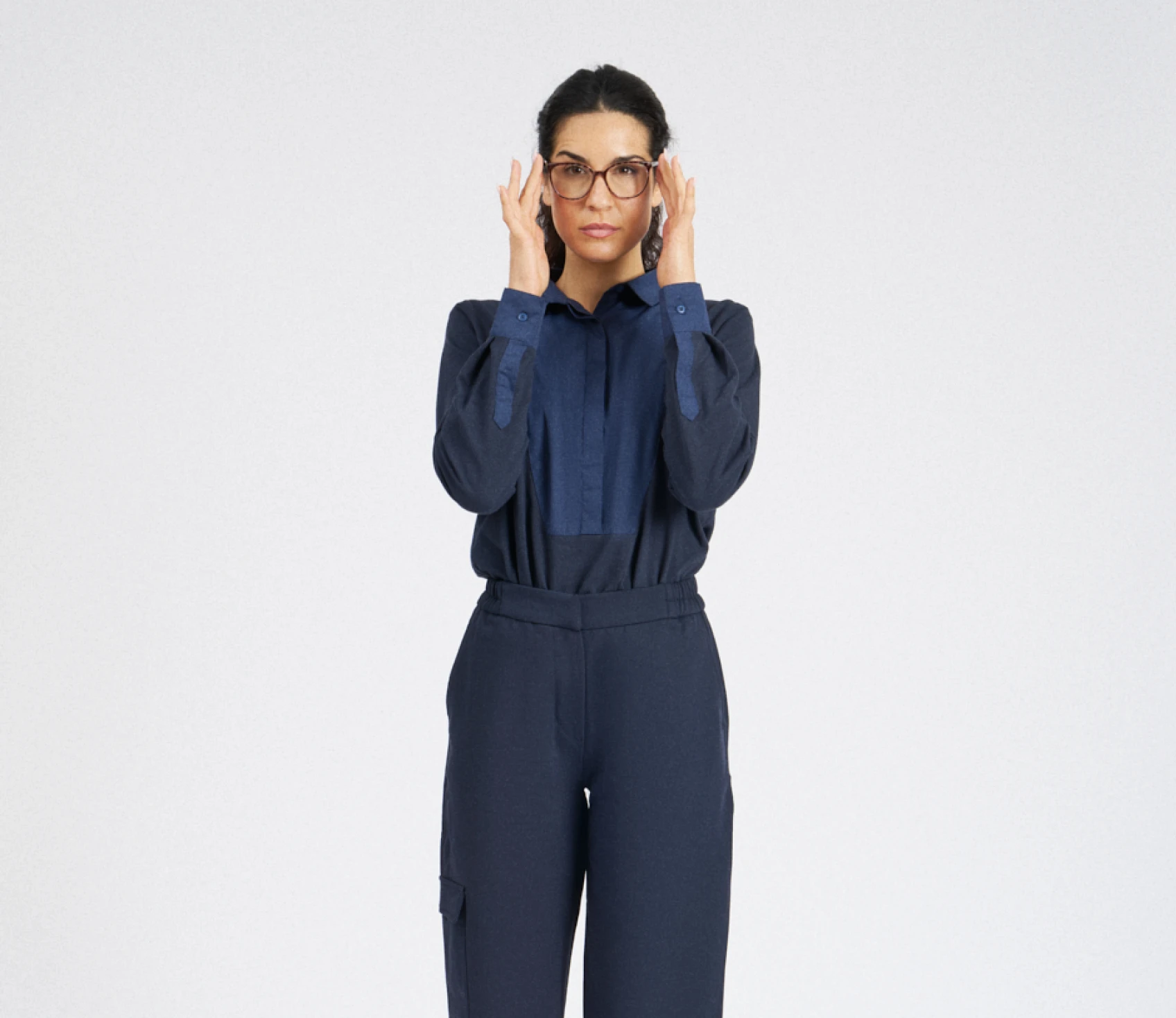
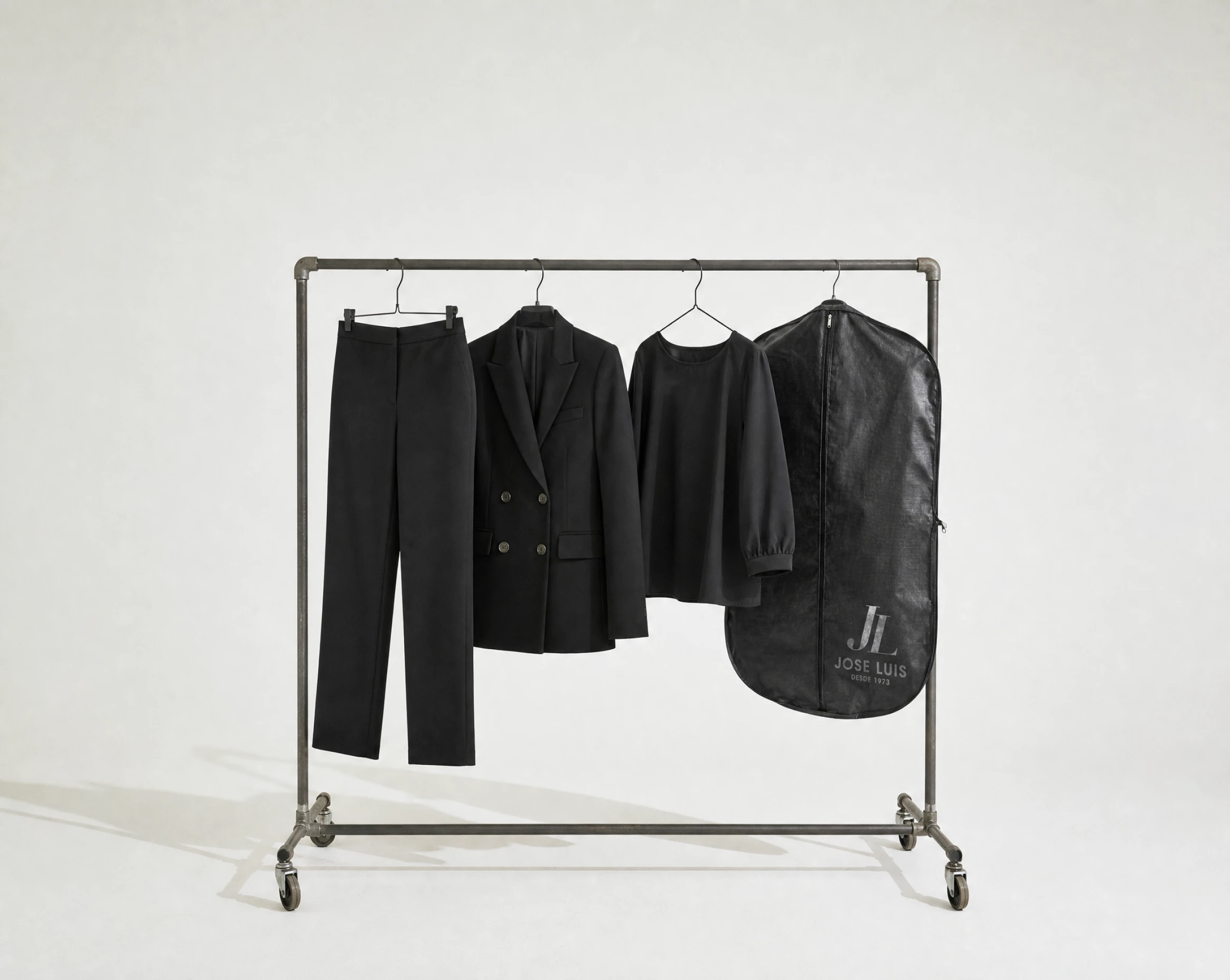
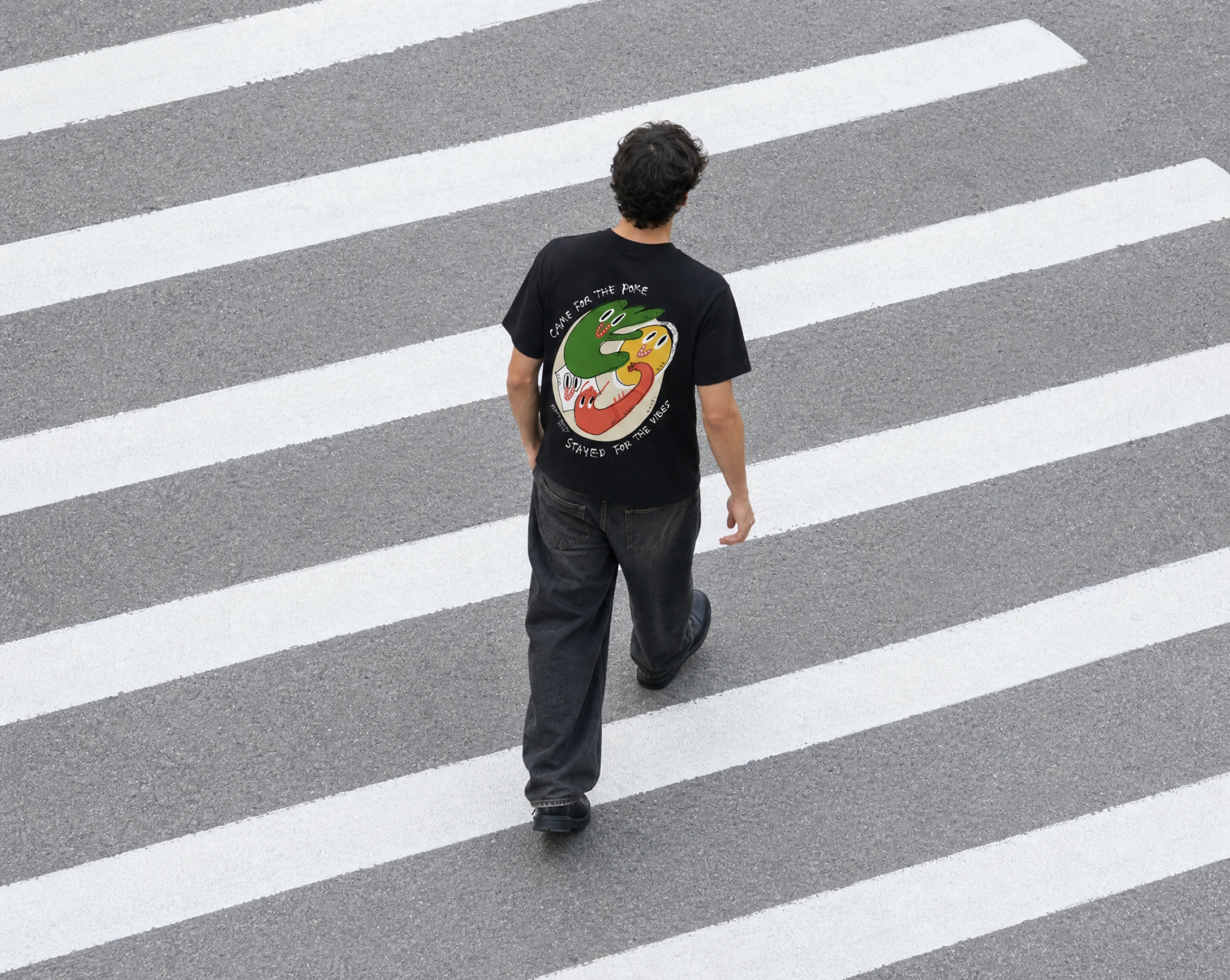
A sensory journey. We begin by drawing a parallel between Japanese Bokashi* and the double meanings so prevalent in Asian culture (the moral and the immoral, the right and the wrong, the provocative and the modest), and Wakka’s food, which is so evocative that it needs to be softened. This multi-sensory journey will transport diners into a diffuse, profound and colourful universe that will give them goosebumps. This journey also continues outside the restaurant, so we extended the concept to the packaging for the delivery service, combining design and functionality to create a range of containers that would meet the needs of the entire menu. Style is the answer. Yes. We made it, too. We’ve also carried the brand’s entire identity over to the restaurant staff’s uniforms. Let yourself be surprised. And that’s how double meanings and Japanese bokashi came to feature throughout Wakka’s brand universe, creating a solid and comprehensive image applicable to all areas and materials within the restaurant.


.svg)




%201_2x.webp)




Any questions?


FAQ