Rooms
Fashion
Brand Identity
Activation
Digital
The Challenge
When BeFlamboyant went barefoot, they knew they needed a new brand identity to reflect their decision. Now they are poised to achieve category leadership.
At VRANDED Haus that the challenge was not to invent anything new, but rather to make visible what they already were. That's why we designed a rebranding that respected their essence, but allowed it to evolve. We rewrote the narrative from an emotional and honest perspective, anchored in their history (their origins as a personal journey) and projected toward the future (barefoot leadership).
Narrative based on respect
Every brand needs a core value that acts as a compass. In the case of BeFlamboyant, that value was respect: for the environment, the community, and one's own body. At VRANDED Haus , we VRANDED Haus treat it as an empty slogan, but as a structuring conceptual framework.
- Respect for the environment, articulated through veganism and the use of organic and recycled materials.
- Respect for the community, both for its fair trade model and its proximity to the customer.
- Respect for the body, through barefoot design, which prioritizes a more natural and healthy way of walking.
This approach allowed us to build a narrative consistent with the product, aligned with the expectations of the conscious consumer, and rich enough to scale and evolve with the brand.
New visual aesthetics: Atlantic wabi-sabi
The aesthetic evolution of the brand had to move away from the clichés of "eco branding" to find its own identity. We started from the idea of wabi-sabi, a Japanese aesthetic that celebrates imperfection, the organic and the ephemeral.
But we did not limit ourselves to importing a style: we reinterpreted it from Galicia, from its forests, its textures, its light and its connection with the sea.
The result was a warm, sincere and minimalist visual universe, where recycled materials and natural textures coexisted with clean design and attention to detail. An image with soul, not an imposture.
Graphic and photographic system: from print to icon
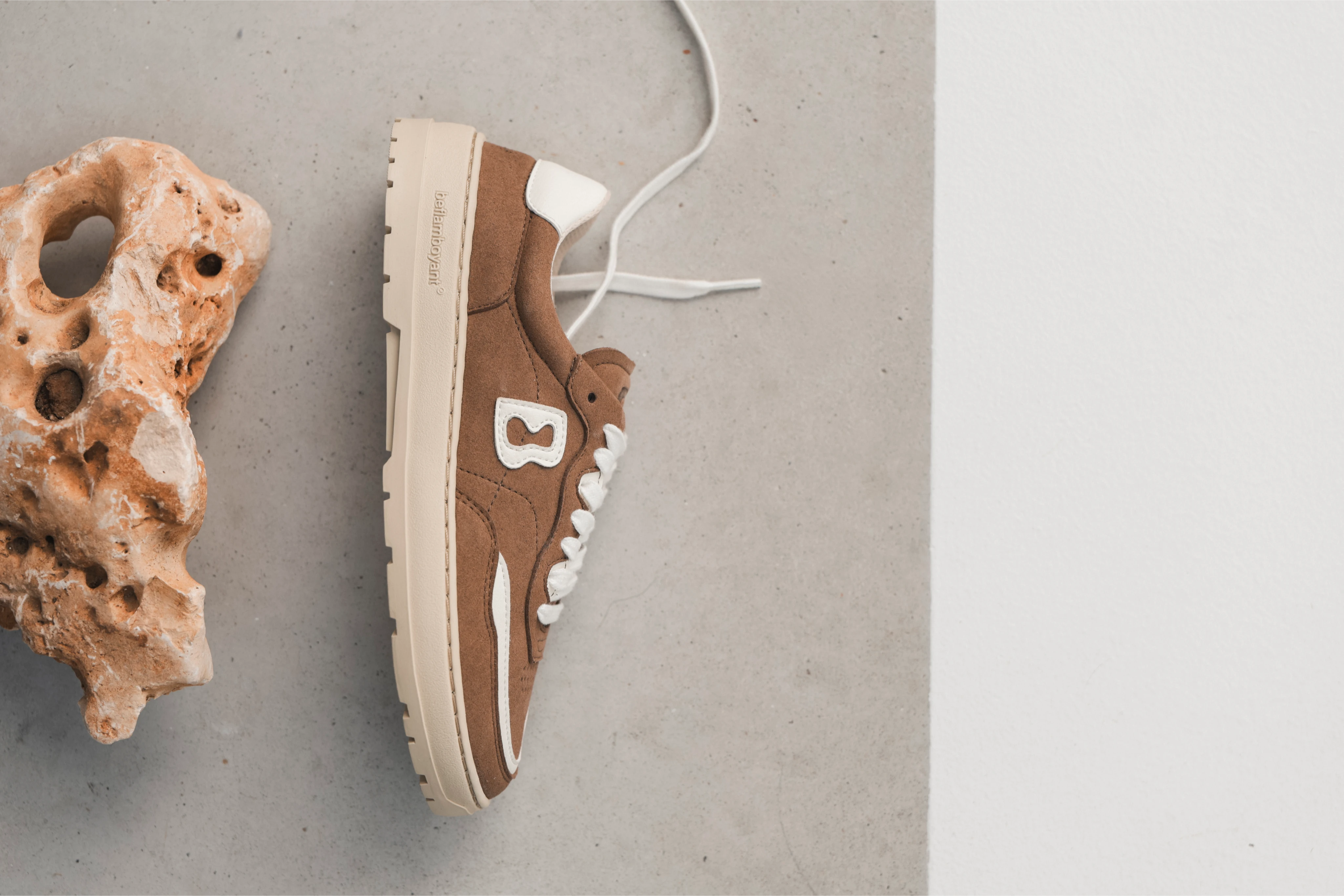
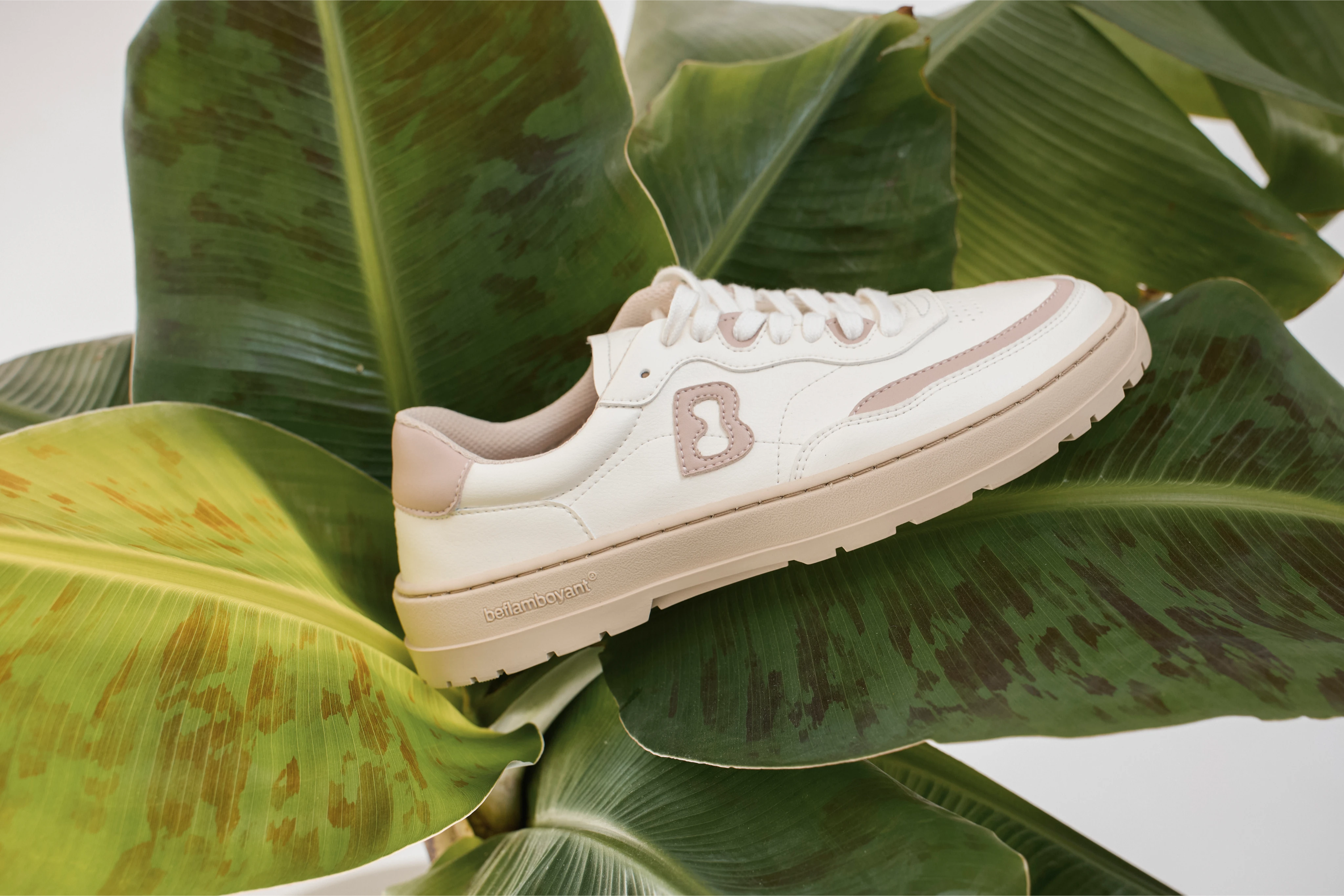
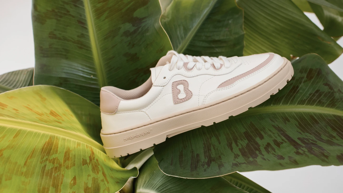
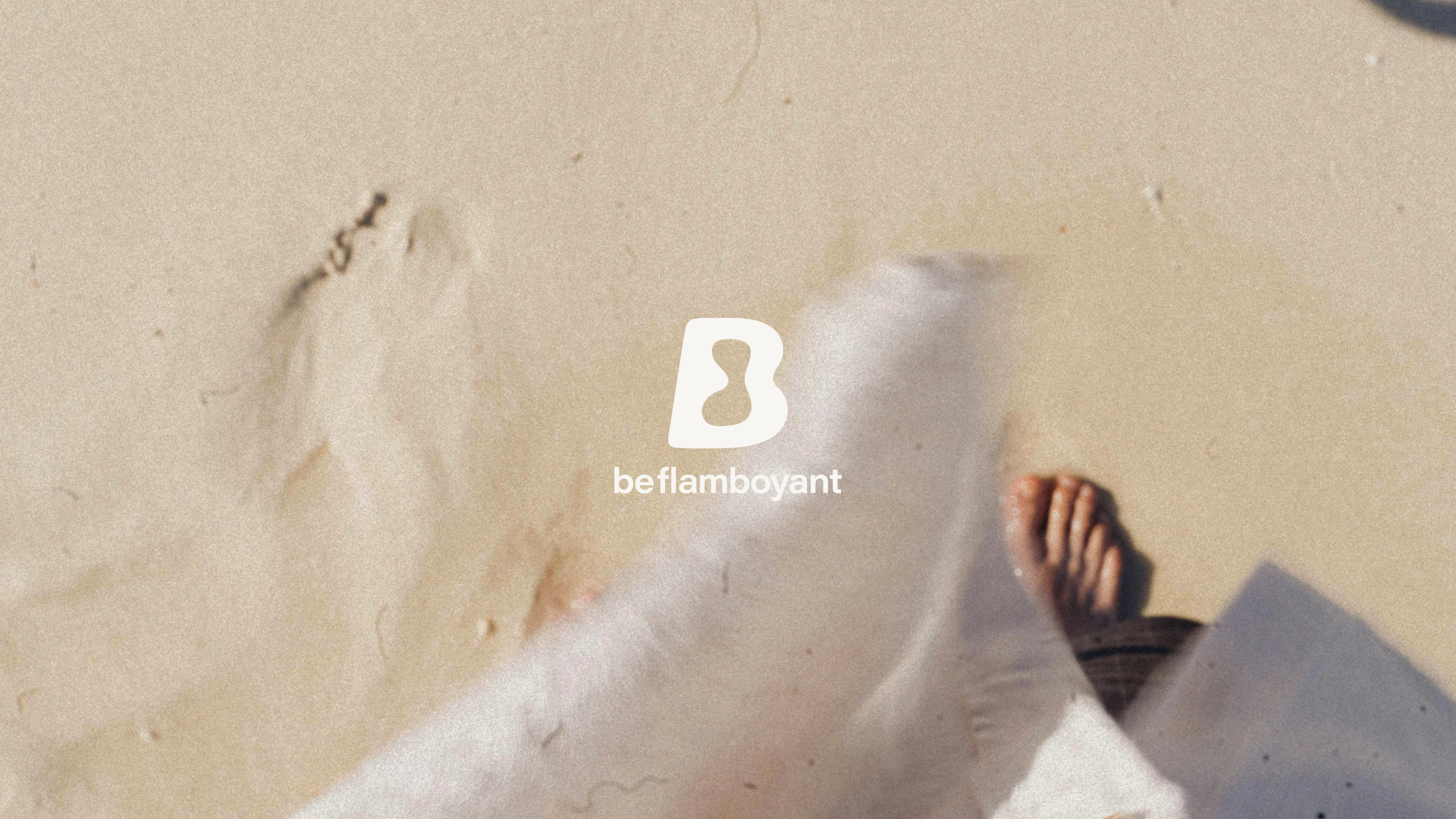
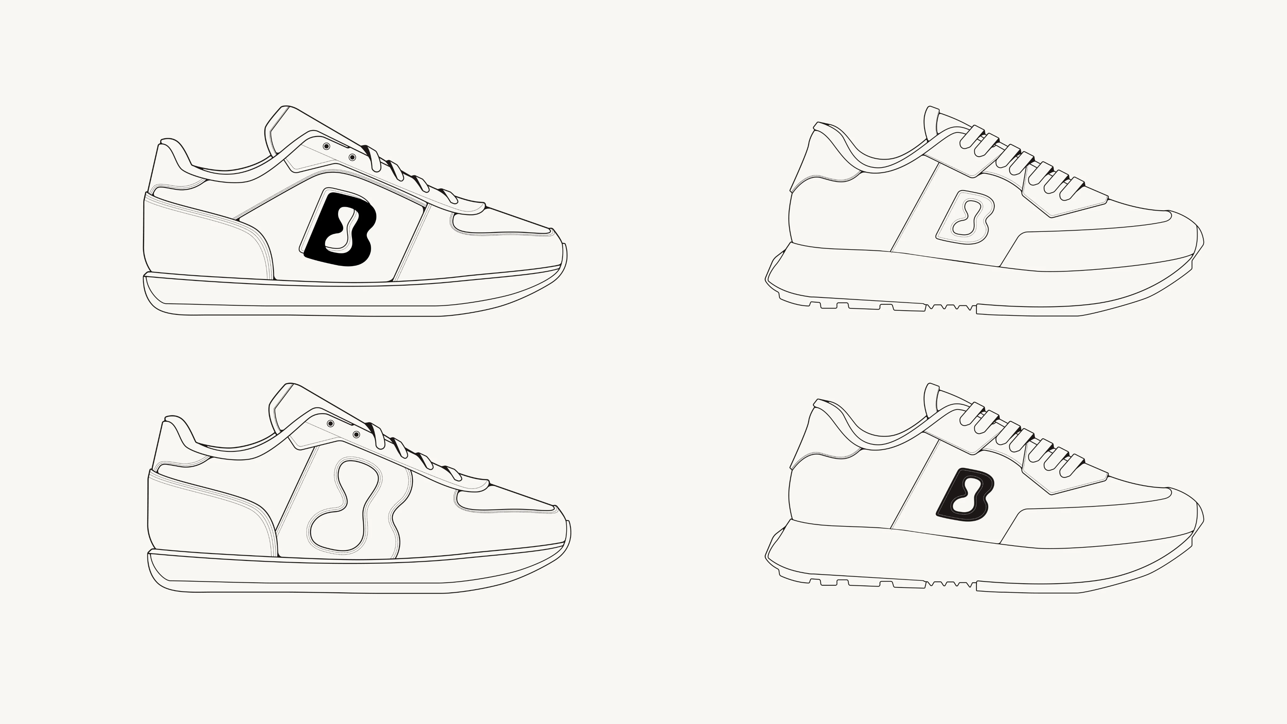
The isotype is born from a footprint: the organic shape left by the barefoot on the sand. A perfect metaphor for a barefoot brand that wants to walk with a light but significant impact.
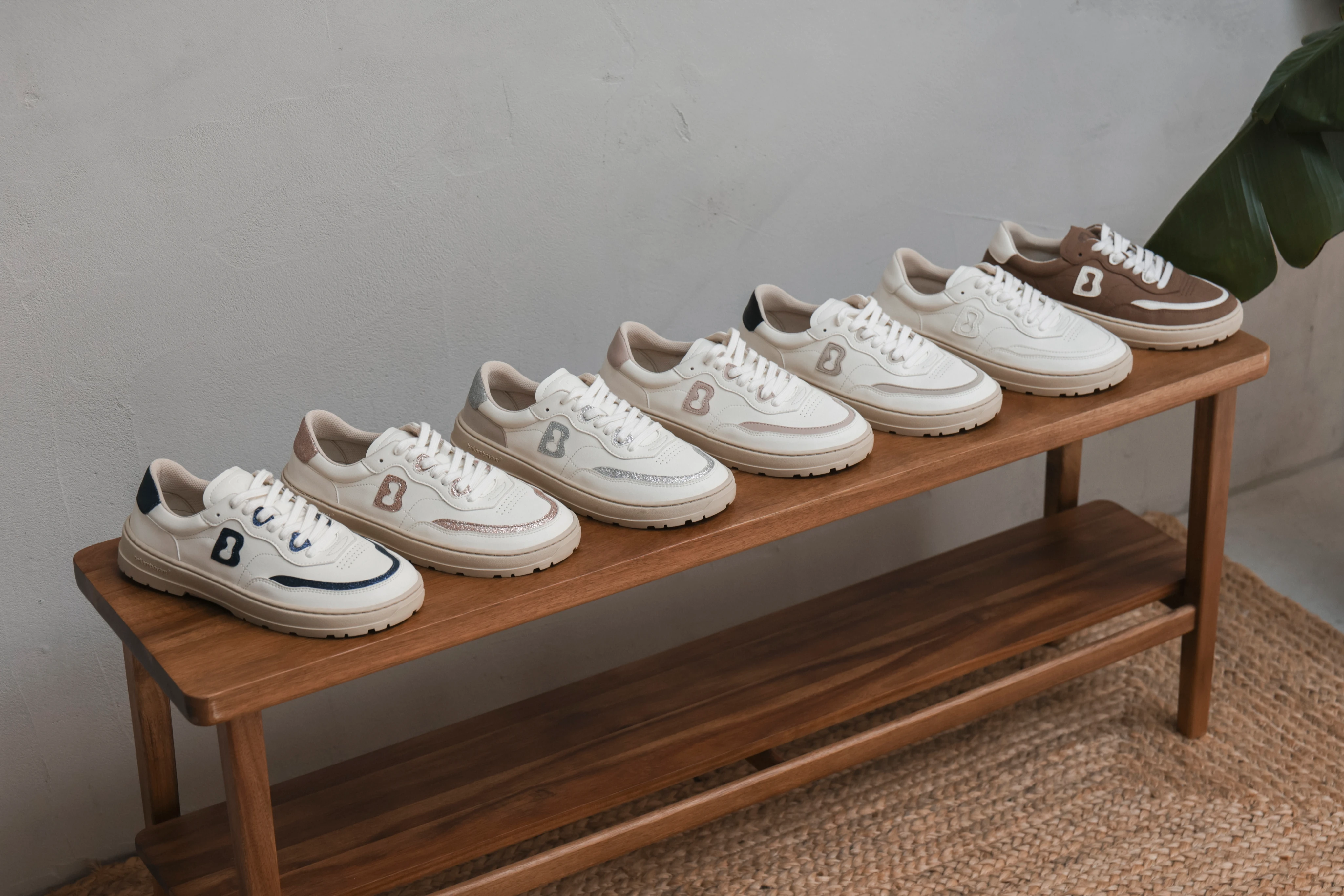
- This "B" mutates with each collection, adapting without losing its essence.
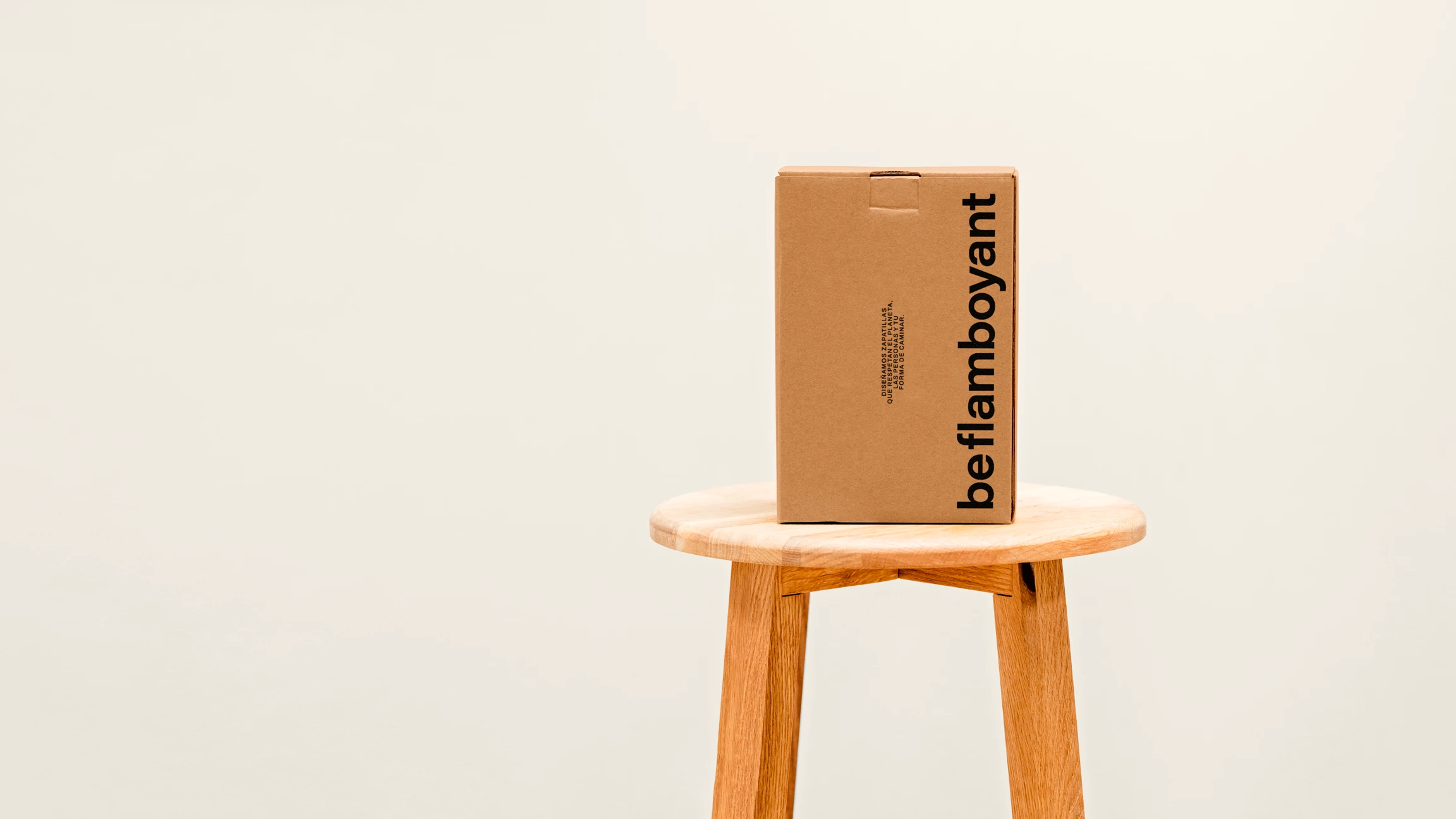
- We created a typographic system based on the Archivo family, versatile and elegant, balancing simplicity with character.
- The photographic style focuses on textures, calm, closeness and authenticity. Each image is an extension of his philosophy: less pose, more truth.
The whole is a flexible, scalable and recognizable system, where design accompanies, not competes.
The result was a more coherent, mature brand with international potential. A brand that not only manufactures sneakers, but also walks towards a fairer world. And it does it -as its tagline says- with honesty: Walk True.