Rooms
Fashion
Brand Identity
Activation
Digital
The Challenge
Koops is a brand of barefoot children's footwear that already had hundreds of thousands of followers and more than sustainable sales. However, they wanted to take a big leap into adult footwear and the world of fashion. And to do that, they needed a new brand and a launch campaign.
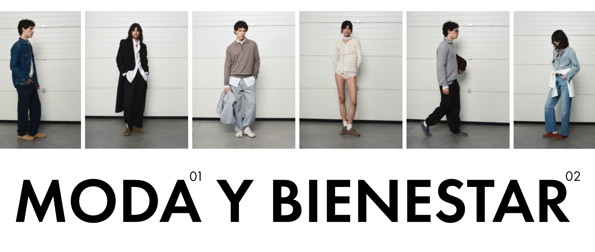
Fashion and wellness
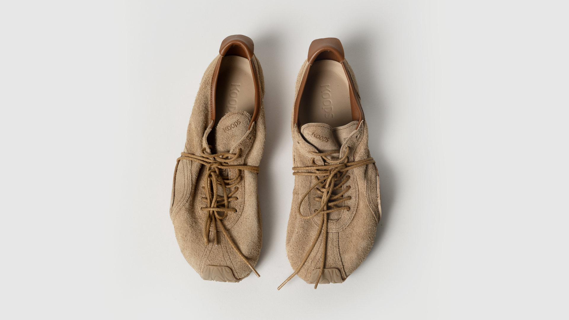
Koops is a barefoot footwear brand that, after conquering the children's category, sought to enter the adult footwear category. To do so, it not only needed a makeover that would serve as a reset, but also a revamped brand identity that would fit its new purpose and maintain its values.
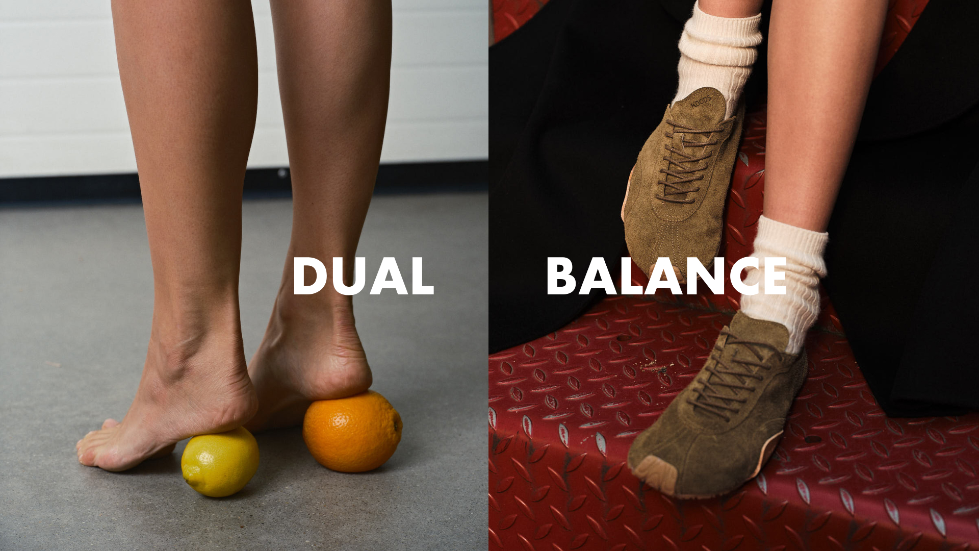
We propose an unapologetic brand, capable of communicating with the most fashionable adults on an equal footing. With a more rebellious spirit but always inspired by the well-being generated by barefoot footwear. We complement all this with a more Zen spirit, connected to our environment through the main element of Koops, the feet, without neglecting the essential aspect of the brand: fashion.
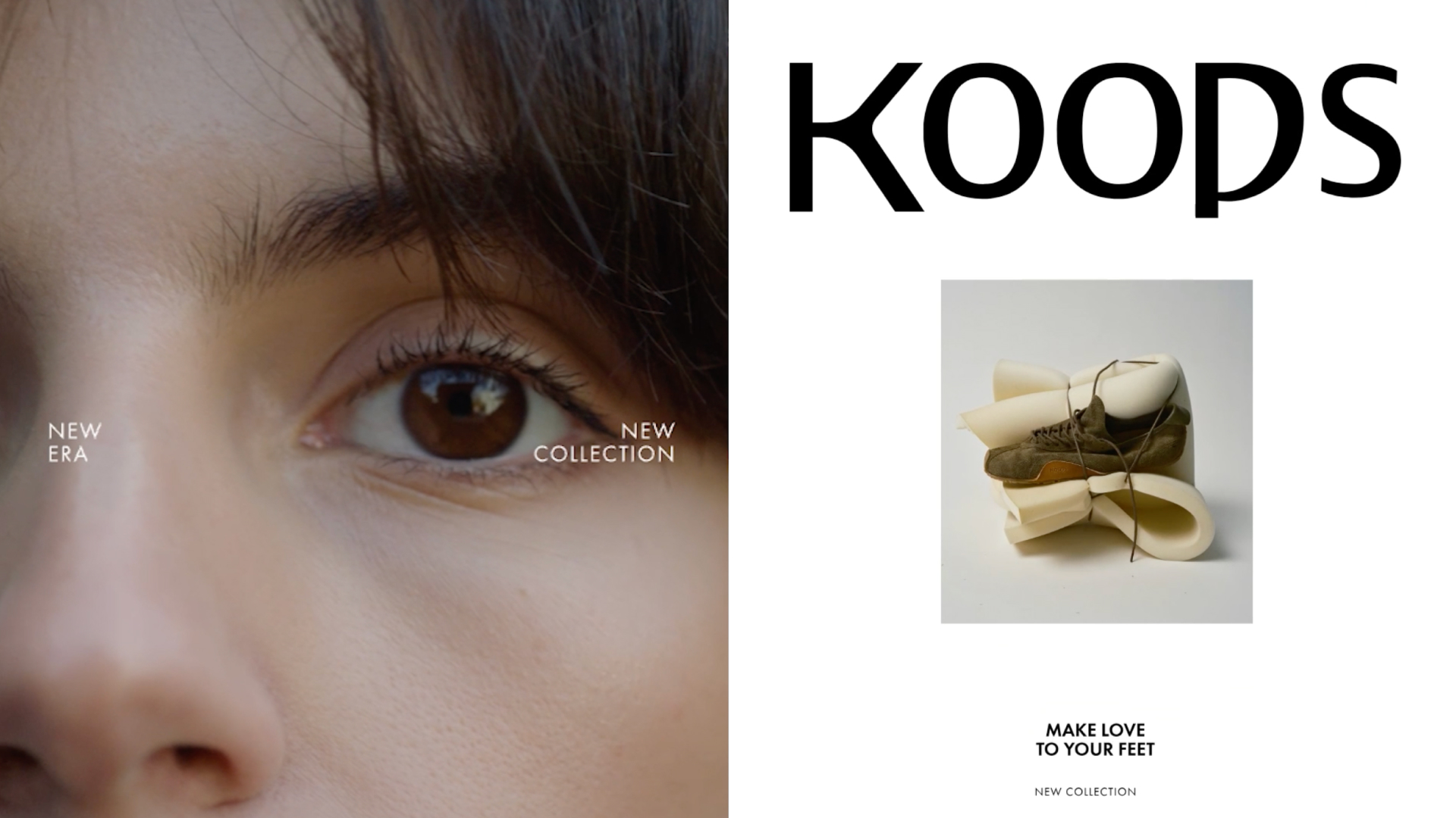
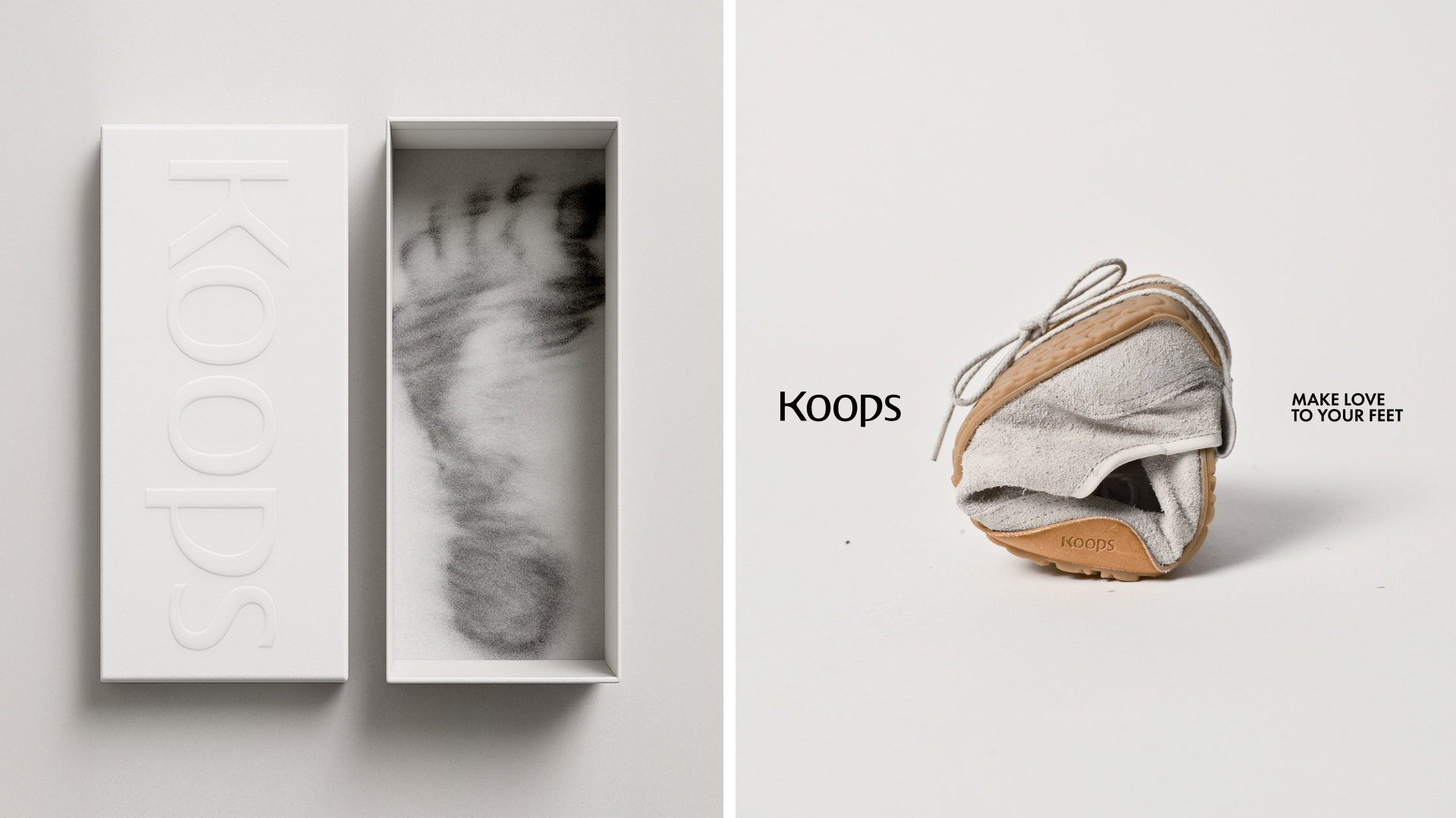
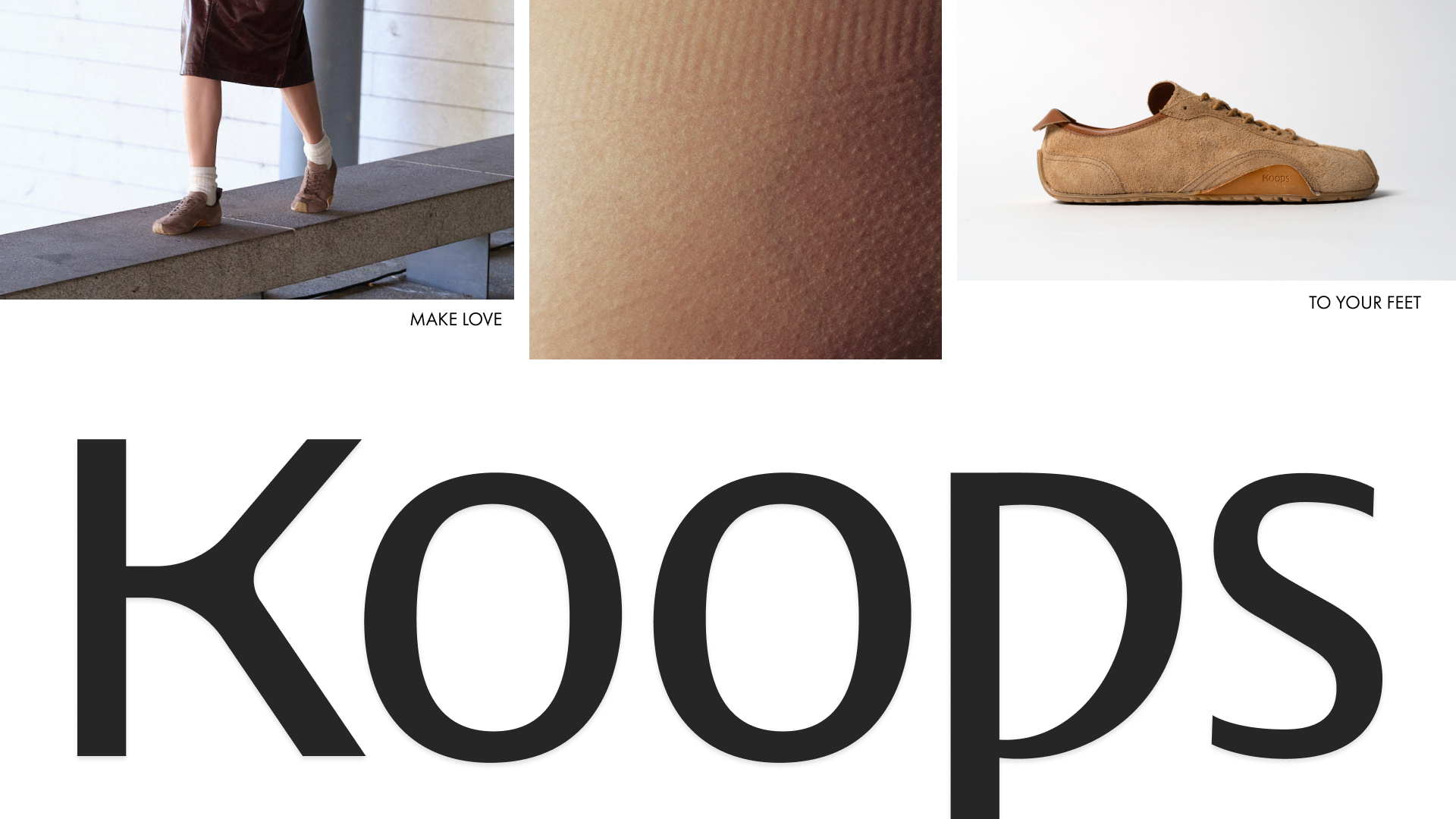
Make Love to Your Feet
For the brand image, we start from the principle of duality, because in the case of Koops, feet live in a constant duality between connection with the earth and the wildness of the city; between the appearance of fashion and the empirical nature of functionality. Innovation and emotion. Instinct and thought.
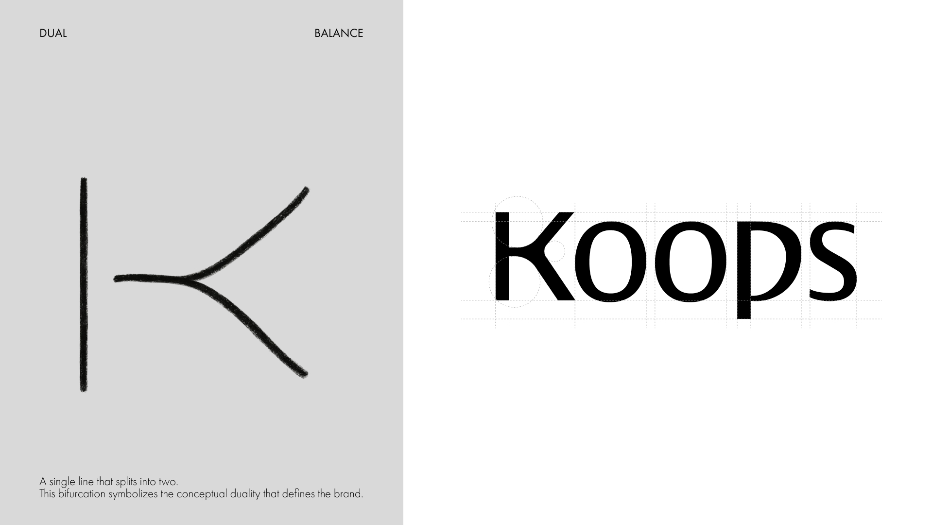
The graphic proposal is based on a simple but powerful visual gesture: a single line that splits in two. This line allows us to elegantly construct the initial "K" in an abstract and synthetic version that can evolve into an iconic symbol for the brand.
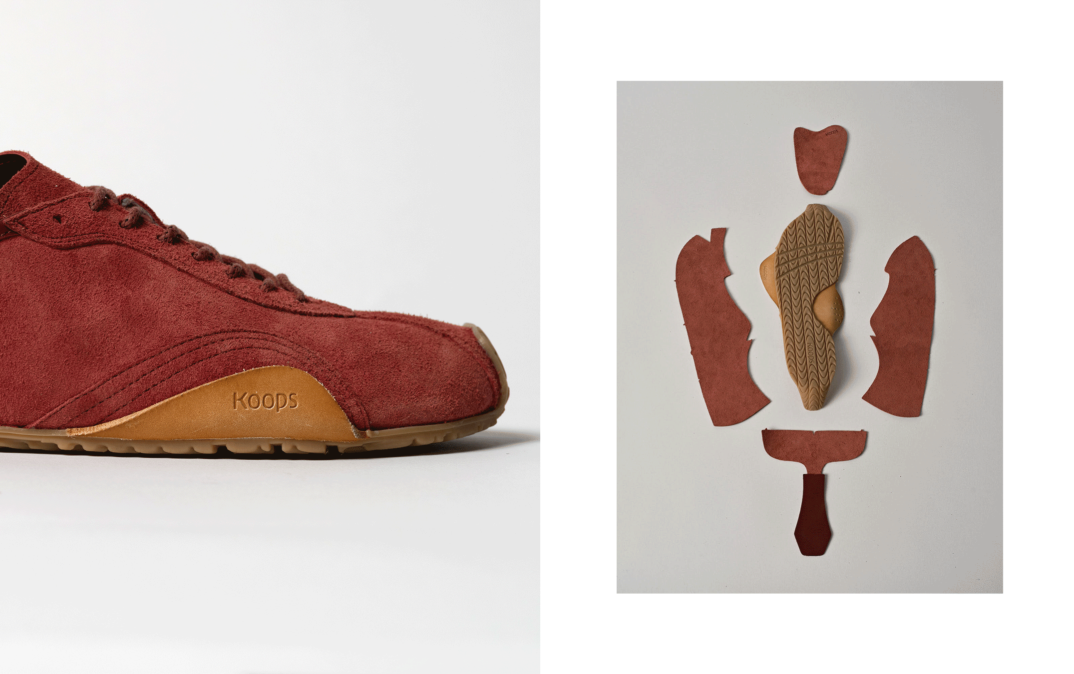
For the "P," we introduced an organic, soft, and expansive shape, directly inspired by the characteristic toe box of barefoot shoes: rounded, spacious, and functional.
The result is an ergonomic, organic, and minimalist logo, complemented by an elegant black-and-white palette and Futura typography that provides structure without rigidity and presence without ostentation.
Una nueva era
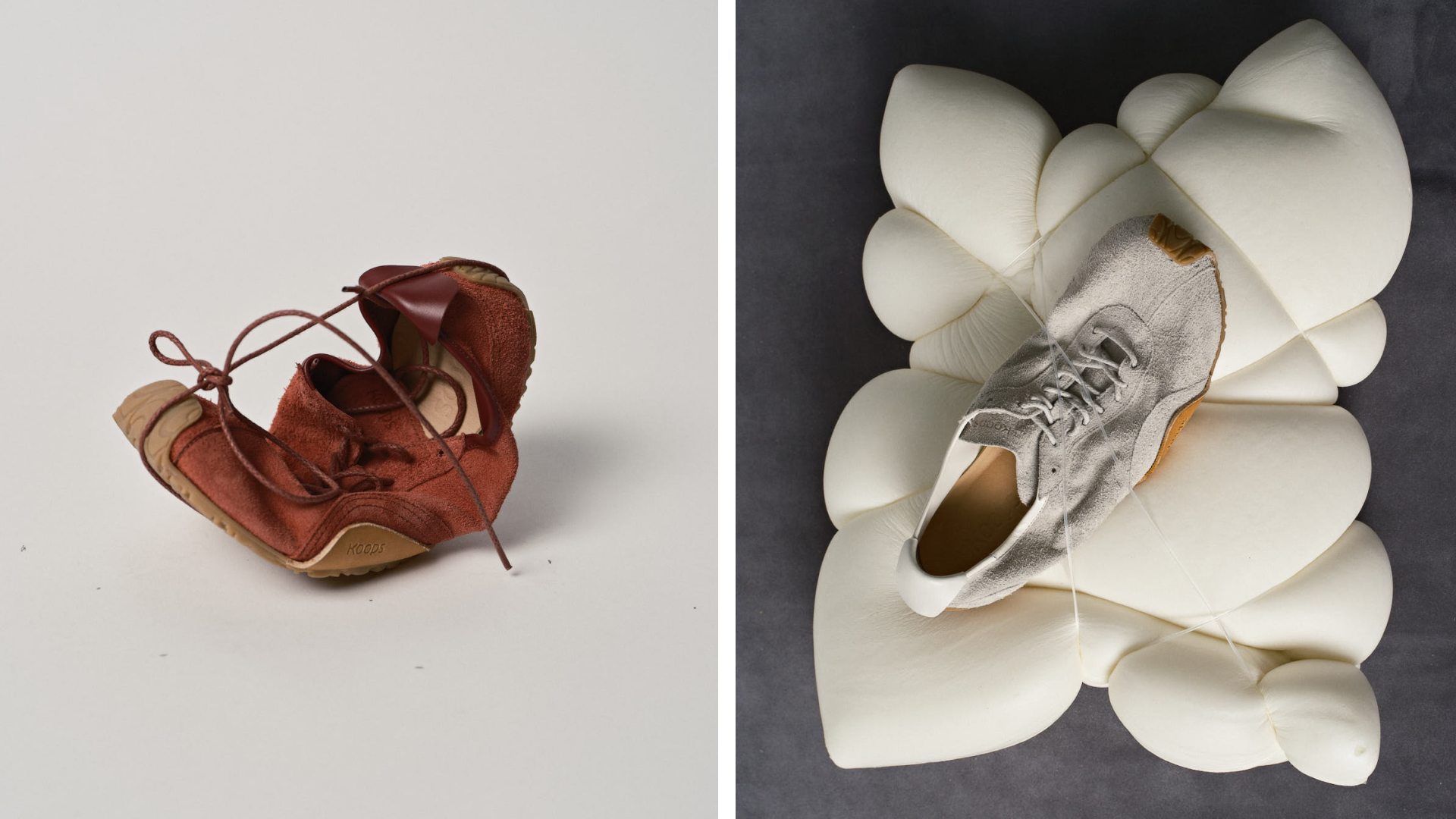
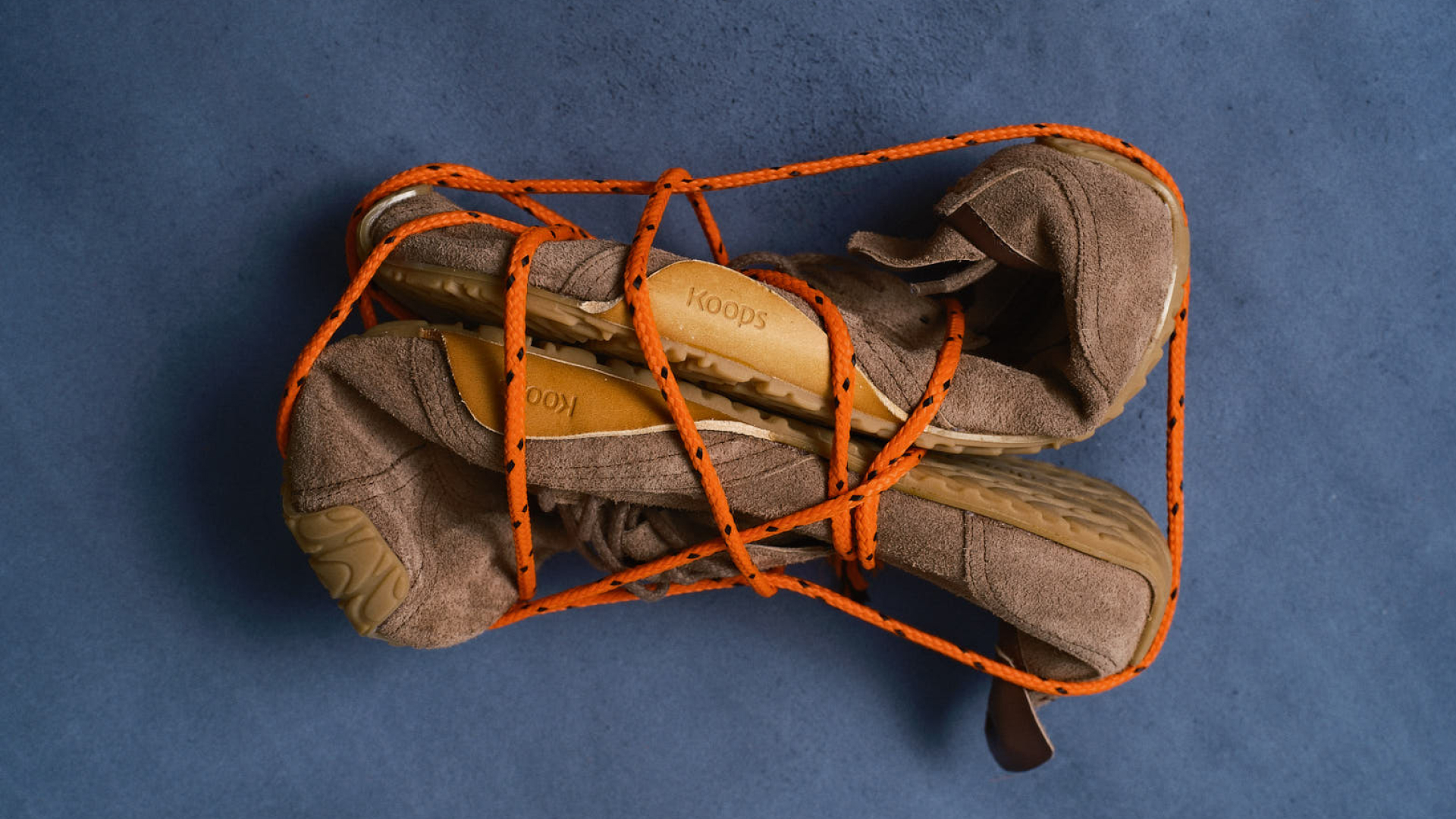
To complete the brand image, we gave Koops its own imagery: visual metaphors. A series of graphic elements that represent how our feet have lived until now, but which also abstract themselves into the world of design and art, in a leap forward for the brand that defines a new journey.
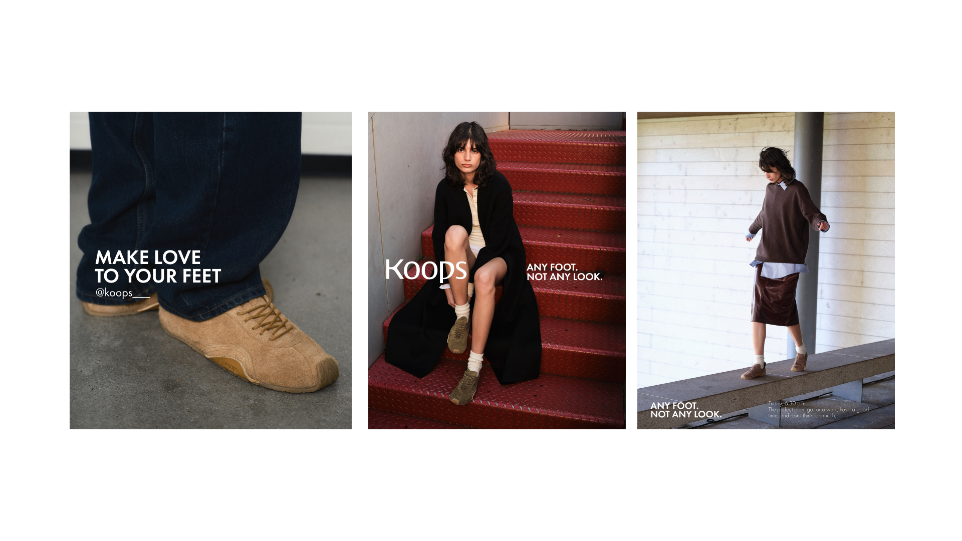
These metaphors served as a starting point for us to develop a multi-channel launch campaign, with a commercial filmed at their own factory, an event centered around the connection that each step generates with its surroundings, and content that broke with their visual image.